Sortieren Abwärts sortieren

Bilder Anzeige Weniger Text

Volltext-Suche Erweiterte Suche Neue Einträge Aktuell

Gesucht wurde Girls Like Us GLU, Medienart , Sortierung DatensatzNr., aufsteigend.
Kein exaktes Ergebnis. Alternative Fundstellen: 168 Treffer
 Hinweis zum Copyright
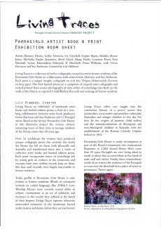
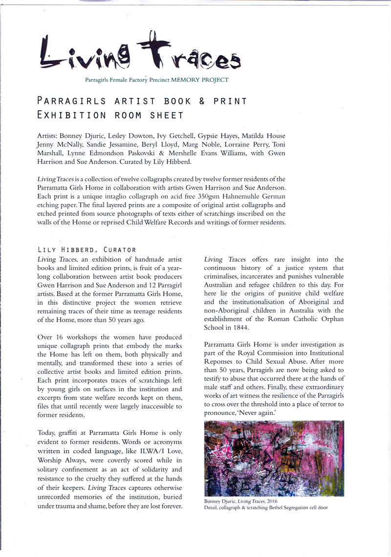
AAP Archive Artist Publications - Munich - www.artistbooks.de
glumagazine plakat

Verfasser
Titel
  • Girls like us
Ort Land
Verlag Jahr
Medium

Technische
Angaben
  • 60x42 cm, 2 Stück. keine weiteren Angaben vorhanden
    Plakat zum Magazin, zweimal gefaltet
ZusatzInfos
  • gefunden in der Ausstellung Paper Weight im Haus der Kunst.
    GIRLS LIKE US is an independent journal turning the spotlight on an international expanding community of women from all genders within arts, culture and activism. Through personal stories, essays and vanguard visuals GIRLS LIKE US unfolds feminist legacies in arts and writing. Mixing politics with pleasure, the magazine is mapping new routes towards a feminist, post-gender future.
    Text von der Webseite
Erworben bei Haus der Kunst
TitelNummer

Verfasser
Titel
  • Wir wissen alle genau, wer die Täter sind - Guerrilla Girls im Kollektiv-Interview: Die Berliner Gruppe „Soup du Jour“ kämpft gegen Diskriminierung, Sexismus und Rassismus in der Kunstwelt
Ort Land
Verlag Jahr
Medium

Technische
Angaben
  • 57,5x39,5 cm, keine weiteren Angaben vorhanden
    Ausriss aus der SZ Nr. 287 vom 12.12.2019, Feuilleton S. 11 HF2
ZusatzInfos
  • Lange schien es, als spare die Debatte um Gleichberechtigung und „Me Too“ die Kunstszene in Deutschland aus. Doch dann wurde es im vergangenen Jahr laut: Sowohl das Gallery Weekend in Berlin als auch die Ausstellung Milchstraßenverkehrsordnung im Künstlerhaus Bethanien wurden heftig kritisiert, weil nur wenige Künstlerinnen oder People of Colour eingeladen waren. Es wirkte, als seien die legendären Guerrilla Girls, eine in den Neunzigern gegründete feministische Aktivistengruppe, nach Berlin umgezogen. Doch hinter den Aktionen stand Soup du Jour, ein Kollektiv, das hier erstmals in einem – als Gruppe geführten – Interview über Ziele und Beweggründe spricht. ...
    Text aus dem Artikel
Sprache
TitelNummer

steinbrecher-yes yes no no-2017-broschur

Verfasser
Titel
  • YES YES NO NO
Ort Land
Verlag Jahr
Medium

Technische
Angaben
  • [16] S., 19x12 cm, keine weiteren Angaben vorhanden
    Broschur, das letzte Blatt ist auf 19 x 4 cm beschnitten
ZusatzInfos
  • His mustache looked like it would tickle. That’s probably the only reason why I didn’t want to kiss him.
    He was a weirdo, but not weird enough, if you know what I mean. He certainly had a flair for details. It wasn’t that. I mean, it’s not like he was wearing a mullet, no. Nor like the kind of guy to gift me a Chinatown Gucci bag. He hated scented soaps and he’d drag me out of any decent party if he found scenty sticks near the toilet. That kind of thing drove him nuts. It’s not like he had anything against grapefruit.
    Early on in our friendship, he gave me a box of Gioconda pencils from Koh-I-Noor. He knew how to get me hooked. But that damn mustache. It was so thick, so neatly trimmed. He paid too much attention to the kind of things I didn’t want to pay attention to. The cappuccino foam in it, however, was a kind of turn-on.
    This is no doubt why you are holding this book in your hands. His mustache, right? Admit it. It’s the bowl of bonbons by the register. But then you go undercover, under the sheets to find a lot of nudity, thwarted porn. Ja, ja, ja: bodies. Corporeality. Corporation, cooperation. Protest. Violence. Religion. Collage. A torn sheet at the back. A misbound book? A defect or just vulnerable?
    Selbsthilfe ist auch keine Lösung (even self-help is not a solution) and Protestvorbild Frankreich (protest “role model” in France?) is the only text you can make out other than mine. You’re meant to struggle to read it, or maybe Erik (who has no mustache) was being intentionally casual about the way he cut out these pictures. It’s an awareness of being sloppy that is so aware, it’s no longer sloppy. A man standing with his fist held high. He’s standing in the window frame of an apartment at least one story up from the ground. He is forty and mad and he enjoys his Bud. His form of protest is a form of solidarity from the sofa. A window protest: comfy. So fucking clever. Then there’s the picture abutting it of a woman holding out her bra. We are meant to take it. She’s offering it to us. Go ahead. She wants you to.
    And then there’s the spooning bodies with their tube socks in a wad next to… a bed. A solar bed. You got it? This book is brown sugar. Stinky Swiss cheese. Bad, bad, good, good.
    April von Stauffenberg
    Text von der Verlagsseite
Sprache
Geschenk von
TitelNummer

nolte-persimone-mc

Verfasser
Titel
  • Persimone - Ein Melodrama in zehn Akten.

Technische
Angaben
  • 21,5x13,9 cm, 2 Teile. keine weiteren Angaben vorhanden
    Musikkassette mit Papphülle (Büroklammer) und Kärtchen mit Downloadcode in gelblichem Seidenpapier eingewickelt. Karte
ZusatzInfos
  • Zur Ausstellung und installativen Soundarbeit im Kunstpavillon 10.-26.06.2022
    Persimone, the fog princess, stringing up sounds, like beads on a thread. Her cheeks are flushed and her hair is dampened by the mist as she climbs through crevices of confusion. Melodrama cut up, rearranged and glued into roughly packaged collages. Unmixed and raw, the sounds guide her endeavors, like soft April sneezes. The pollen girls are awakened by the winds, sadness slivers its way through organ patches and sex appeal crawls up all six strings. Alas, the night, in two brackets, holding time and place together, keeping her safe.
    Text von der Webseite
Sprache
WEB Link
Erworben bei Paulina Nolte
TitelNummer

fingerpainting-on-mars-01

Verfasser
Titel
  • Fingerpainting on Mars edition 01
Ort Land
Medium

Technische
Angaben
  • [16] S., 29,6x21 cm, keine weiteren Angaben vorhanden
    mehrfach gefaltetes Blatt
ZusatzInfos
  • Welcome to the amazon issue, a collection of kick-ass women and their work. some are well-known, some not so much. some are men, and that's ok too. ...
    Text vom Blatt
Stichwort / Schlagwort
Geschenk von
TitelNummer

olbrich-quadflieg-fruehe-werke-pk

Titel
  • Frühe Werke und noch frühere Werke und Sunny Girls
Ort Land
Medium

Technische
Angaben
  • [2] S., 16,2x10,5 cm, keine weiteren Angaben vorhanden
    Postkarte, Buchdruck
ZusatzInfos
  • Frühe Werke & noch frühere Werke & Sunny Girls. Jürgen O. Olbrich und Claus Quadflieg zeigen D. Mann am Donnerstag, 22. November, um 20 Uhr, im Kasseler Kunstverein, Ständeplatz 16. Olbrich und Quadflieg präsentieren in einer genehmigten, theatralischen Aktion der D. Mann-Gesellschaft eben jenen D. Mann. Dabei werden neben klärenden Worten, auch tiefe Einblicke in Schaffen und Werken des Künstlers dargebracht und gleichzeitig wieder in Frage gestellt. Sollte D. Mann nicht persönlich die Aktion mit seiner Anwesenheit krönen, so wird doch sein Geist an diesem Abend sicherlich den Kunstverein erfüllen. o.
    Zitiert aus GHK 2. Jahrgang Nr 13 Kasseler Hochschulzeitung 22. November 1979
Sprache
Stichwort / Schlagwort
Geschenk von
TitelNummer

im-unterschied-positionen-91

Verfasser
Titel
  • Im Unterschied - Positionen zeitgenössischer Künstlerinnen
Ort Land
Medium

Technische
Angaben
  • [18] S., 21x13,6 cm, keine weiteren Angaben vorhanden
    Kartonumschlag, Drahtheftung
ZusatzInfos
  • Ein Projekt des RealismusStudio der Neuen Gesellschaft für bildende Kunst Berlin in Zusammenarbeit mit der Hochschule der Künste Berlin, gefördert durch Frauenfördermittel der HdK 1991.
    Mit Beiträgen u.a. zu: Gruppe Weibsbilder, Natalja Struve, Grace Renzi, Guerilla Girls und Barbara Kruger.
Sprache
TitelNummer

lemke-badgirll
lemke-badgirll
lemke-badgirll

Lemke Klaus: Bad Girl Avenue, 2018

Verfasser
Titel
  • Bad Girl Avenue
Ort Land
Verlag Jahr
Medium

Technische
Angaben
  • [2] S., 14,8x10,5 cm, 2 Stück. keine weiteren Angaben vorhanden
    Werbekarte zum Film
ZusatzInfos
  • In der Komödie verarbeiten Frauen ihre nichtsnutzigen Partner zu "Mimöschen", die sie dann bei Bedarf nach ihren Vorstellungen wieder auswildern können.
    Zuerst bricht sich Judith (Judith Paus) den rechten Fuß, dann bricht sie das Herz des kleinen Autodiebs Rocky (Panagiotis Matsangos), der von Berlin nach München geflüchtet ist. Judith gibt Rocky weiter an Anabell (Anabell Griess-Nega), die ihn nach Gebrauch weiterreicht an Valentina (Valentina Häberle), die ihn wiederum als Inspiration beim Klavierspielen benutzt. Inzwischen hat sich Daidy (Daidy Mair), die Vierte der "Bad Girls", das nächste Opfer eingefangen. Aber den Girls genügt es nicht, die Männerwelt zu dominieren. Sie fragen sich, wie man aus weiblicher Überlegenheit ein für Männer artgerechtes Business-Modell zaubern kann. Und das Drama nimmt ungebremst, aber ganz heimlich seinen Lauf.
    Text von der ZDF Seite
Sponsoren
Sprache
Geschenk von
Erworben bei Straße
TitelNummer

the-boys-and-girls

Verfasser
Titel
  • The Boy's and Girls Inside Mount Fiji
Ort Land
Verlag Jahr
Medium

Technische
Angaben
  • [84] S., 24,8x19,8 cm, keine weiteren Angaben vorhanden
    Broschur, Farblaserdruck
ZusatzInfos
  • Andrea Stultiens (1974, NL) received a Bfa and Mfa in photography at HKU University of the Arts and AKV St Joost in Breda respectively, and a Ma in photographic studies from Leiden University. Currently she divides her time between the Netherlands and Uganda.
    Stultiens' artistic practice deal with photography in relation to understandings of the presentations of histories. Since 2007 her work originates mostly on the African continent and always develops in collaborations with others.
    Since 2002 Stultiens has been teaching at Academy Minerva in Groningen (NL), where she was involved in setting up, and and recently started leading, a research group that looks at the use of photography in cross-disciplinary and cross-cultural artistic practices (PRICCAPractice). Stultiens won several awards, among others the Steenbergen Stipendium 1998, Bouw in Beeld Prijs 2009, GiDi Photo Art Award 2012. She exhibits and publishes internationally, with a focus on Uganda and the Netherlands.
    Text von der Webseite.
Sprache
Stichwort / Schlagwort
Geschenk von
TitelNummer

xylander-emily-gamma-girls

Verfasser
Titel
  • Gamma Girls vs. Gigantopus
Ort Land
Verlag Jahr
Medium

Technische
Angaben
  • [16] S., 21x14,8 cm, Auflage: 20, 3 Teile. keine weiteren Angaben vorhanden
    Drahtheftung, Plastikmäppchen mit Filzstiften Plastiktütchen mit Stickern. Verpackt in Kunststofftüte.
ZusatzInfos
  • Comic der "Gamma-Girls" zum selbst gestalten. In dem Heft finden sich lediglich die Schwarz-Weiß Illustrationen, die nach Belieben mit den beigelegten Stiften und Stickern ausgemalt und beklebt werden können, sodass sich immer eine individuelle Geschichte ergibt.
Sprache
Geschenk von
TitelNummer

szamosi-girls-and-their-food-on-instagram-volumes-1-and-2

Szamosi Sofia: Girls and their Food on Instagram, Volumes 1 & 2, 2016

Verfasser
Titel
  • Girls and their Food on Instagram, Volumes 1 & 2
Verlag Jahr
Medium

Technische
Angaben
  • [16] S., 21,6x14 cm, keine weiteren Angaben vorhanden
    Fadenheftung, handgenäht, schwarz-weiß
ZusatzInfos
  • Das Format von Instagram wird durch reichhaltige Illustrationen auf Papier gebracht, mit Kommentaren zu einer Subkultur einer Subkultur von Foodies.
    Text von der Webseite, übersetzt mithilfe von DeepL.
Sprache
Erworben bei Booklyn
TitelNummer

39_alessandro_apai
39_alessandro_apai
39_alessandro_apai

Apai Alessandro: Dear routine, 2017

Verfasser
Titel
  • Dear routine
Ort Land
Medium

Technische
Angaben
  • 106 S., 21x14,8 cm, Auflage: Print on Demand, 2 Stück. keine weiteren Angaben vorhanden
    Broschur
ZusatzInfos
  • Schwarz-Weiß-Drucke, Nr. 039 aus der Reihe 100for10.
    Alessandro Apai is a young freelance illustrator and graphic artist from Italy and current based in Barcelona. His works are inspired by perfectly normal everyday interactions and social experiences. His aim is to use the drawing’s practice like a vehicle to documents and interpret his daily observation of the world and to could translate whatever concept in images. He had work on commissioned projects for clients like the Guardian, Zeit Magazin, it’s Nice That and many others. He also use to work on personal projects like the weekly series “Relaxed Sunday with Family” started in 2014, that you can follow each Sunday.
Sprache
Stichwort / Schlagwort
Geschenk von
Erworben bei Melville Brand Design
TitelNummer

monok-bofill

Verfasser
Titel
  • MONO.KULTUR #36 Ricardo Bofill - The Future of the Past
Ort Land
Verlag Jahr
Medium

Technische
Angaben
  • 48 S., 20x15 cm, ISBN/ISSN 18617085
    Drahtheftung, gedruckt auf verschiedenen Papieren
ZusatzInfos
  • where to begin with an architect as over the top as Ricardo Bofill, notorious since the 1970s for his vast city-like housing estates that look like surreal experiments in crossbreeding desert caves with Star Wars. an architect who has designed over 1000 projects in the space of five decades, from perfume bottles to city plans, and pretty much everything in between. who has worked in a style – or a hundred styles – that is as unique as it is impossible to describe. who founded a leftist collective that would eventually end up building airport terminals. whose life reads somewhat like a fairytale itself, taking us from fascist Spain under Franco’s rule to the celebrity frenzy of our modern times, with the Bofill clan holding a somewhat unique position among Spanish tabloids? To add any more is to inevitably leave out too much. With mono.kultur, Ricardo Bofill talked about fifty years of architecture, the vagaries of ambition and how Modernism killed the city. Visually, the issue offers a disorienting journey of architectural splendour with plenty of previously unpublished images from the archives of Ricardo Bofill (as well as the odd film still of naked bodies). Using partial high gloss varnish throughout, it is a pleasing juxtaposition of the natural and the artificial, the intellectual and the sexual, the disciplined and the decadent.
    Text von der Website.
Weitere
Personen
Sprache
Stichwort / Schlagwort
TitelNummer

maccarthy-i-got-a-clit

Verfasser
Titel
  • Streichholzbriefchen – I got a clit
Ort Land
Verlag Jahr

Technische
Angaben
  • 4,8x3,8 cm, 4 Teile. keine weiteren Angaben vorhanden
    Konvolut aus vier bedruckten Streichholzheftchen, teils handbeschrieben.
ZusatzInfos
  • Teil einer Installation, die in der Ausstellung "Marlene McCarty – Mund Verkehr: In die Hose gegangen" in der NGBK Berlin, 6.06.–12.07.1992 gezeigt wurde. Aus der Pressemitteilung zur Ausstellung:
    Marlene McCarty’ (1957) Interesse gilt dem Machtgebaren und den patriarchalen Strukturen, der von ihnen geprägten männlichen Umgangssprache. Die alltäglichen Sprüche die ihr, einer Frau, auf den Straßen New Yorks zugerufen werden, die unverstellten oder unverschämten Aufforderungen mit denen sie konfrontiert wird, sind das Ausgangsmaterial für ihre künstlerischen Strategien wie für ihre Kunstobjekte.
    Marlene McCarthy zur Installation: “This is a floor sculpture and it’s 15,000 matchbooks. They’re standard matchbooks you can order from a catalog. On one side they have pinup girls on them, and on the other side I had them print, ‘I got a clit so big I don’t need a dick.’ If you’ll notice, clit and dick are handwritten. The company had called me up and were like, ‘Ummm, we have a problem. We can print dick but we can’t print THAT OTHER WORD.’ She wouldn’t even say the word clit. So I said OK, take the mechanical—this was in the olden days—and just slice the dick and the clit off. Then I got some friends together and we wrote them all in by hand. I’m reproducing these for the retrospective, but the curator is worried about whether we can have NYU students writing dick and clit 15,000 times. Maybe the seniors can do it.”
    Texte von den Webseiten.
Sprache
Geschenk von
TitelNummer

Verfasser
Titel
  • Girls like us - Lesbian Quarterly, 5 Spring 2007
Verlag Jahr
Medium

Technische
Angaben
  • 80 S., 22,7x16,5 cm, keine weiteren Angaben vorhanden
Stichwort / Schlagwort
TitelNummer

pichler-publishing-manifestos

Verfasser
Titel
  • Publishing Manifestos - An International Anthology from Artists and Writers
Verlag Jahr
Medium

Technische
Angaben
  • 342 S., 23,9x17,1 cm, ISBN/ISSN 9780262544924
    Broschur mit Klappen
ZusatzInfos
  • Buch, das eine Sammlung an Manifesten - der letzten Jahrzehnte bis in die Gegenwart - von Künstler*innen, Autor*innen, Redakteur*innen, Verleger*innen, Designer*innen, etc., die das Publizieren als künstlerische Praxis erkunden, darstellt.
Sprache
Geschenk von
TitelNummer

Verfasser
Titel
  • LIKE a book / this book, like a book
Ort Land
Verlag Jahr
Medium

Technische
Angaben
  • 112 S., 23,5x16,5 cm, ISBN/ISSN 9053492925
Stichwort / Schlagwort
TitelNummer

Verfasser
Titel
  • Boxwerk - float like a jet, sting like a hornet
Ort Land
Verlag Jahr
Medium

Technische
Angaben
  • 14,8x10,4 cm, keine weiteren Angaben vorhanden
    Werbekarte
WEB Link
TitelNummer

hale-morris-inside

Verfasser
Titel
  • Getting Inside Simon Morris Head
Ort Land
Medium

Technische
Angaben
  • 324 S., 19,8x12,8 cm, Auflage: 500, ISBN/ISSN 978-1-907468216
    Softcover, Taschenbuch
ZusatzInfos
  • Getting Inside Simon Morris’ Head is a performative retyping of Simon Morris’ conceptual bookwork Getting Inside Jack Kerouac’s Head. Like Morris’ original performance of retyping the scroll edition of Jack Kerouac’s On the Road, Joe Hale’s project first appeared as a blog. At the rate of one page per day, like Morris retyping Kerouac before him, Hale retyped Morris’ entire book and in doing so re-retraces Kerouac’s famous adventure. Morris gave us all of Kerouac’s pages in reverse order: each blog post presented one page and the default settings of the blog platform organised his posts in reverse order, from the newest to the oldest. Now inverted again, as a double negative, Hale has restored the direction of travel to the story and produced a wholly (un)original new text. This first printed edition takes the imitative gesture to a new extreme. It features an introductory essay by poet Kenneth Goldsmith and reuses Morris’ paratext. From the cover design to the choice of paper, Hale tests the limits of conceptual extension.
    Text von der Webseite
Stichwort / Schlagwort
Geschenk von
Erworben bei Simon Morris
TitelNummer

karasik-soviet-photobook

Verfasser
Titel
  • The Soviet Photobook 1920-1941
Ort Land
Verlag Jahr

Technische
Angaben
  • 644 S., 29,4x27,4x6 cm, ISBN/ISSN 9783958290310
    Hardcover, in bedrucktem Karton.
ZusatzInfos
  • The Soviet Union was unique in its formidable and dynamic use of the illustrated book as a means of propaganda. Through the book, the U.S.S.R. articulated its totalitarian ideologies and expressed its absolute power in an unprecedented way—through avant-garde writing and radical artistic design that was in full flower during the 1920s and ’30s. No other country, nation, government or political system promoted itself more by attracting and employing acclaimed members of the avant-garde. Among them were writers like Semion Kirsanov, Vladimir Mayakovsky, Ilya Selvinsky, Sergei Tretyakov and Kornely Zelinsky. artistic designers like Gustav Klutsis, Valentina Kulagina, El Lissitzky, Sergei Senkin, Varvara Stepanova, Solomon Telingater and Nikolai Troshin. and photographers including Dmitry Debabov, Vladimir Griuntal, Boris Ignatovich, Alexander Khlebnikov, Yeleazar Langman, Alexander Rodchenko, Georgy Petrusov—not to mention many of the best printers and book binders.
    The Soviet Photobook 1920–1941 presents 160 of the most stunning and elaborately produced photobooks from this period and includes more than 400 additional reference illustrations. The book also provides short biographies of the photobook contributors, some of whom are presented here for the first time.
    Text von der Webseite.
Weitere
Personen
Sprache
Erworben bei art book cologne
TitelNummer

gfeller-early80-v

Verfasser
Titel
  • Mini Zine - Early 80's San Fransisco, USA
Ort Land
Verlag Jahr
Medium

Technische
Angaben
  • [32] S., 15x11,2 cm, Auflage: 125, keine weiteren Angaben vorhanden
    Drahtheftung, zweifarbiger Siebdruck, Infotext auf Flyer, mehrfach gefaltet und eingelegt
ZusatzInfos
  • This is a small selection from the Tom Law collection which is now in the collection of Stanford Libraries. The whole collection features over 1400 hand bills from San Fransisco's 80's music scene from bands like Flipper, Sonic Youth, Dead Kennedys, Sun Ra, The Dicks, Hüsker Dü, Grateful Dead and many more. This zine is printed in different colours, therefore there is no copy like the other. What you see here is just an example of the colours. A small story about the collection is also included.
    Text von der Website.
Sprache
Stichwort / Schlagwort
Erworben bei beuys on sale / ReSurgo
TitelNummer

wordpharmacy_adjectives

Titel
  • wordpharmacy - Adjectives - Contens: 238
Ort Land

Technische
Angaben
  • 18x30 cm, ISBN/ISSN 978-3-943196054
    Kartonbox 10x11,5x7,5 cm (HxLxB, auseinandergefaltet 18x30 cm, mit Beipackzettel A4 gefaltet auf 4x7 cm
ZusatzInfos
  • Wordpharmacy combines the structure of language with the healing principles of various medicaments. Like pills, language is something to be consumed by the body, and in turn it does not only affect our conceptions of things, but it also comes to designate our very corporal movability in the world. Consequently, words are not only something we consume, they are refractory entities that in turn define and consume us. Wordpharmacy can be seen as a poetical gesture endeavouring to let words work their magic from within the body itself. The Wordpharmacy is written and produced by the danish poet Morten Søndergaard. The Wordpharmacy has be shown in several cities like Paris and London and Berlin and Bangor and Tromsø and Voss. The Wordpharmacy is translated into English by Barbara Haveland and designed by Christian Ramsø and is now available in six languages.
    Text von der Webseite
Weitere
Personen
Sprache
Stichwort / Schlagwort
TitelNummer

32_thomas_hedger
32_thomas_hedger
32_thomas_hedger

Hedger Thomas: On them grades, 2017

Verfasser
Titel
  • On them grades
Ort Land
Medium

Technische
Angaben
  • 106 S., 21x14,8 cm, Auflage: Print on Demand, 2 Stück. keine weiteren Angaben vorhanden
    Broschur
ZusatzInfos
  • Schwarz-Weiß-Drucke, Nr. 032 aus der Reihe 100for10.
    I’m a young illustrator currently moored on the Thames in my houseboat. Working from my home studio I like to draw in a variety of mediums, more recently focusing on vector graphics. I enjoy the fast paced nature of vectors, which allows me to capture vivid ideas in a hopefully bold, interesting and thought provoking manner. Working regardless of brief I like to continue to produce a body of work to satisfy my creative habits. This has led to sharing daily drawings online via Instagram, which is a great platform to discover and meet other creatives. I have had the honour of working with some fantastic individuals over the past year, which I try to share online via my website. This September I plan to go to Central Saint Martins to further my studies, devote my time to and produce more art! I’m looking forward to all that this opportunity has to offer.
Sprache
Geschenk von
Erworben bei Melville Brand Design
TitelNummer

groh-breslau-poetry
groh-breslau-poetry
groh-breslau-poetry

Groh Klaus: Experimentelle Poesie - Retrospektive aus 15 Jahren, 1999

Verfasser
Titel
  • Experimentelle Poesie - Retrospektive aus 15 Jahren
Ort Land
Verlag Jahr
Medium

Technische
Angaben
  • [4] S., 21x14,5 cm, Auflage: 150, numeriert, signiert, 131 Teile. keine weiteren Angaben vorhanden
    Drei Flyer, einmal gefaltet, acht Bogen Künstlerbriefmarken, perforiert. Zwei Bögen signiert und nummeriert.
ZusatzInfos
  • Zur Ausstellung Experimentelle Poesie, 13.04.-13.05.2000 in der Japtak Galerie, Breslau. Letters, Parts of Letters, Words, Parts of Words are working materials for me like color, structures and lines for human artistic communications. They belong to human origin like signs, symbols and ideas. I try with these elementary materials of human communication to create happenings of reading and discovering new thoughts in mind, real and life. It is a permanent dialog between material, thoughts and discovering new ideas and structures.
    Text vom Flyer.
Sprache
Geschenk von
TitelNummer

summers_if-london
summers_if-london
summers_if-london

Summers J. Somers: IF LONDON WERE LIKE VENICE. Se Londra fosse come Venezia - Invisible Cities, 2018

Verfasser
Titel
  • IF LONDON WERE LIKE VENICE. Se Londra fosse come Venezia - Invisible Cities
Ort Land
Verlag Jahr
Medium

Technische
Angaben
  • 38 S., 16,5x12 cm, Auflage: 200, numeriert, 3 Teile. ISBN/ISSN 9788896590669
    Fadenheftung, mit rotem Faden, Papier Umschlag rau, Fotos Schwarz-Weiß. Mit zwei eingelegten Visitenkarten, Format 5,5x8,5 cm, Prägedruck in Blau auf gerissenem dunkelgrünem Papier, 7x10 cm
ZusatzInfos
  • Reihe Invisible Cities, hrsg. v. Pierpaolo Pregnolato.
    Basiert auf Fotografien von 1899, auf denen venezianische Gondeln in den Kanälen von London fahren
Weitere
Personen
Sprache
Stichwort / Schlagwort
TitelNummer

nouns

Titel
  • wordpharmacy - Nouns - Contents: 431
Ort Land

Technische
Angaben
  • 18x40,5 cm, ISBN/ISSN 978-3-943196054
    Kartonbox 10,5x11,8x7,5 cm (HxLxB, auseinandergefaltet 18x40,5 cm, mit Beipackzettel A4 gefaltet auf 7x7,7 cm
ZusatzInfos
  • Wordpharmacy combines the structure of language with the healing principles of various medicaments. Like pills, language is something to be consumed by the body, and in turn it does not only affect our conceptions of things, but it also comes to designate our very corporal movability in the world. Consequently, words are not only something we consume, they are refractory entities that in turn define and consume us. Wordpharmacy can be seen as a poetical gesture endeavouring to let words work their magic from within the body itself. The Wordpharmacy is written and produced by the danish poet Morten Søndergaard. The Wordpharmacy has be shown in several cities like Paris and London and Berlin and Bangor and Tromsø and Voss. The Wordpharmacy is translated into English by Barbara Haveland and designed by Christian Ramsø and is now available in six languages.
    Text von der Webseite
Weitere
Personen
Sprache
Stichwort / Schlagwort
Geschenk von
TitelNummer

032c_quarantine-2020

Koch Joerg, Hrsg.: 032c Fanzine - Quarantäne!, 2020

Verfasser
Titel
  • 032c Fanzine - Quarantäne!
Ort Land
Verlag Jahr
Medium

Technische
Angaben
  • [40] S., 29,7x21 cm, keine weiteren Angaben vorhanden
    Farblaserdruck, gefaltete Einzelblätter, mit Gummiband zusammengehalten. PDF-Download von der Webseite
ZusatzInfos
  • “We want you to GO INSIDE — your house, and your self. Everything is about interiors now: the interior of your home, your mind, your archive, your hard drive. Mine it all for insight and purpose.
    Once that’s done, show off what you find – just because you’re alone doesn’t mean you can’t share from within. There is no such thing as “too much information” now; COVID-19 took out “TMI.” In fact, there is no more “enough” — enough data, enough circulation, enough fodder. Binge on it. Burn out on it. Document it. Post it. Build a website for it. Get turned on by it. Get freaked out by it. Open up your screens, talk about your dreams, slide into those DMs. Get dressed up to go absolutely nowhere. Never go out, but leave nothing “behind the scenes” – there is no “behind,” and no “in front of” either. There is only “now,” and it is Big and Flat. Closeness happens at a distance here, but dialogue has never been this intimate. Your private hygiene is a matter of public health, your personal cloister backdrops community debate. Dualities — east and west, north and south, us and them, out and in — melt into each other and coat the old world like lava, like an act of god. In the New Interior isolation is a commons, the self that inhabits it is a collective. Historical moments stack vertically and occur simultaneously, around the globe. Welcome to the novel sanctum sanctorum, the single-occupant House of We.
    Text von der Webseite
Weitere
Personen
Sprache
Erworben bei 032c
TitelNummer

groh-experimentelle-poesie-stamps-2000

Groh Klaus: Experimentelle Poesie 2000, 2000

Verfasser
Titel
  • Experimentelle Poesie 2000
Ort Land
Verlag Jahr
Medium

Technische
Angaben
  • [4] S., 21x14,5 cm, Auflage: 150, numeriert, signiert, 16 Teile. keine weiteren Angaben vorhanden
    Bogen Künstlerbriefmarken, perforiert
ZusatzInfos
  • Erschienen zur Ausstellung Experimentelle Poesie, 13.04.-13.05.2000 in der Japtak Galerie, Breslau. Letters, Parts of Letters, Words, Parts of Words are working materials for me like color, structures and lines for human artistic communications. They belong to human origin like signs, symbols and ideas. I try with these elementary materials of human communication to create happenings of reading and discovering new thoughts in mind, real and life. It is a permanent dialog between material, thoughts and discovering new ideas and structures.
    Text vom Flyer.
Sprache
Geschenk von
TitelNummer

2021_kwon_apple_tree_submarine

Verfasser
Titel
  • Apple Tree Submarine
Ort Land
Verlag Jahr
Medium

Technische
Angaben
  • [68] S., 27,5x21 cm, 2 Teile. keine weiteren Angaben vorhanden
    Broschur, Katalog mit eingelegter Einladungskarte A5 zur Ausstellung in der Galerie Boutwell Schabrowsky, Theresienstr.48, München, 15.06 -20.06.2021
ZusatzInfos
  • "The Apple Tree Submarine is a unique art project with which artist Oh-Seok Kwon wants to create an “Art Community”.
    You – as an art lover – will be involved in it. How? Learn more at the opening and the following days of the project week.
    Apple Tree Submarine reflects the artist’s life stages, feelings and aspirations. In a series of drawings, he captures these milestones. The drawings are to be understood as Oh-Seok Kwon’s diary. Like the submarine, the artist looks at the world from a distance. He asks himself questions about being human, being rushed in the modern world, the excesses of striving “higher and higher – more and more” and the current insecurity. Thus, the flying submarine is like the artist’s eyes with which he permeates the world. As the title suggests, Oh-Seok Kwon has taken an apple tree on his journey through Munich and further around the world. Why? That would be too long a story at this point."
    Text von der Webseite
Weitere
Personen
Sprache
Stichwort / Schlagwort
Geschenk von
TitelNummer

klaus-groh-experimentelle-poesie-2000

Groh Klaus: Experimentelle Poesie 2000, 2000

Verfasser
Titel
  • Experimentelle Poesie 2000
Ort Land
Verlag Jahr
Medium

Technische
Angaben
  • 21x14,5 cm, Auflage: 150, numeriert, signiert, 16 Teile. keine weiteren Angaben vorhanden
    Bogen Künstlerbriefmarken, perforiert, Farblaserkopien
ZusatzInfos
  • Erschienen zur Ausstellung Experimentelle Poesie, 13.04.-13.05.2000 in der Japtak Galerie, Breslau. Letters, Parts of Letters, Words, Parts of Words are working materials for me like color, structures and lines for human artistic communications. They belong to human origin like signs, symbols and ideas. I try with these elementary materials of human communication to create happenings of reading and discovering new thoughts in mind, real and life. It is a permanent dialog between material, thoughts and discovering new ideas and structures.
    Text vom Flyer.
Sprache
Geschenk von
TitelNummer

early-eighties-part-1-2021-second-edition-de-bongout

Verfasser
Titel
  • Mini Zine - Early 80's San Fransisco, USA - Part.1
Ort Land
Verlag Jahr
Medium

Technische
Angaben
  • [32] S., 15x11,2 cm, Auflage: 125, 2 Stück. keine weiteren Angaben vorhanden
    Drahtheftung, zweifarbiger Siebdruck auf 170g Papier, mittig eingebundener gefalteter Flyer auf orangenem Papier
ZusatzInfos
  • Zweite Edition. Die erste erschien 2018 als ein einzelnes Heft und ist ebenfalls im AAP archiviert. Manche der Motive wiederholen sich, andere sind neu.
    This is a small selection from the Tom Law collection which is now in the collection of Stanford Libraries. The whole collection features over 1400 hand bills from San Fransisco's 80's music scene from bands like Flipper, Sonic Youth, Dead Kennedys, Sun Ra, The Dicks, Hüsker Dü, Grateful Dead and many more. This zine is printed in different colours, therefore there is no copy like the other. What you see here is just an example of the colours. A small story about the collection is also included.
    Text von der Website
Sprache
Stichwort / Schlagwort
Erworben bei beuys on sale / ReSurgo
TitelNummer

early-eighties-mini-zine-bongout-2021-second-edition-part-2

Verfasser
Titel
  • Mini Zine - Early 80's San Fransisco, USA - Part.2
Ort Land
Verlag Jahr
Medium

Technische
Angaben
  • [32] S., 15x11,2 cm, Auflage: 125, 2 Stück. keine weiteren Angaben vorhanden
    Drahtheftung, zweifarbiger Siebdruck auf 170g Papier, in verschiedenen Farben gedruckt
ZusatzInfos
  • Zweite Edition. Die erste erschien 2018 als ein einzelnes Heft und ist ebenfalls im AAP archiviert. Manche der Motive wiederholen sich, andere sind neu.
    This is a small selection from the Tom Law collection which is now in the collection of Stanford Libraries. The whole collection features over 1400 hand bills from San Fransisco's 80's music scene from bands like Flipper, Sonic Youth, Dead Kennedys, Sun Ra, The Dicks, Hüsker Dü, Greatfull Dead and many more. This zine is printed in different colours, therefor there is no copy like the other.
    Text von der Website
Sprache
Stichwort / Schlagwort
Erworben bei beuys on sale / ReSurgo
TitelNummer

yuzin-freak-like-me

Verfasser
Titel
  • Yuzin - Freak like me
Ort Land
Verlag Jahr
Medium

Technische
Angaben
  • [24] S., 29,5x10,4 cm, keine weiteren Angaben vorhanden
    Sechs, mittig gefaltete Papierbögen. Mit Sicherheitsnadeln zusammengehalten.
ZusatzInfos
  • "Yuzin - Club Cultural" ist ein Plattform aus Andalusien, die kulturelle Angebote und Inhalte fördert und verbreitet. Neben den Informationen über diverse Veranstaltungen können auch die Tickets über die Plattform erworben werden. Außerdem wird in den Städten Granada, Sevilla und Málaga einmal im Monat ein ein kostenloses Magazin veröffentlicht. In Granada wird das Heft bereits seit 2003 produziert. Diese Ausgabe zeigt einen Schwarz-Weiß-Comic namens "Freak like me".
Sprache
Stichwort / Schlagwort
Geschenk von
Erworben bei Ovni Bazar
TitelNummer

kallinikou-where-are-you-going-young-man

Kallinikou Stelios: Where are you going young man, handsome like a legend, 2017

Verfasser
Titel
  • Where are you going young man, handsome like a legend
Medium

Technische
Angaben
  • 21x14,7 cm, keine weiteren Angaben vorhanden
    Plakat, Kreuzfaltung
ZusatzInfos
  • Begleitmaterial zur gleichnamigen Ausstellung, die von 29.04.-09.06.2017 im Point Centre for Contemporary Art stattfand.
    In dieser Bildserie setzt Kallinikou seine Recherchen über die Politik der Landschaft fort. Diesmal fotografiert er rätselhafte Landschaften in der Natur Zyperns. In den meisten dieser Landschaften kann man Höhlen erkennen, die das menschliche Element in diese Bilder einführen. Eine primitive Form der Architektur oder Tore zu einer anderen Dimension? Wir werden Zeuge von Kallinikous peripatetischer Reise und seinen Bemühungen, die Verstecke zu finden und zu fotografieren, die von der EOKA-Guerilla während des nationalen Befreiungskampfes von 1955 bis 1959 gegen die britische Herrschaft gebaut und genutzt wurden. Der Wald als heiliger Ort wird zu dem Raum, in dem Kallinikou, der sich auf ursprünglichen Pfaden bewegt, über die wahre Natur der Dinge nachdenkt.
    Text von der Webseite, übersetzt mithilfe von DeepL.
Sprache
Stichwort / Schlagwort
Geschenk von
TitelNummer

ganzeer-zine-el-arab-1

Verfasser
Titel
  • Zine El Arab #1
Verlag Jahr
Medium

Technische
Angaben
  • [50] S., 28x21,5 cm, Auflage: 100 ca., signiert, keine weiteren Angaben vorhanden
    geklammerte Fotokopien, ein Blatt als Sticker eingebunden. Kopiert im August 2019
ZusatzInfos
  • ... If you know me at all, then you know I like to operate where I see vacuums in the culture. Zine El-Arab came about precisely for that reason. This was 2011, a time of great revolutionary upheaval that started in Tunisia, spilled over into Egypt, and kind of spread from there not just in the region but halfway across the world.
    By late 2011, there was really no denying the ripples of change pulsating through Cairo. It was evident on the streets, in music, conversations, at art galleries, on television, it was everywhere. But I was growing frustrated that there didn’t seem to be any regular publication that featured the voices of dissent that were otherwise all around you. It felt like there was a rift between everyday voices and what was being published, and how cool would it be if there were at least one? Especially if it were a crude one. ...
    ... Die Formel war scheinbar ganz einfach. Das Titelbild (von mir erstellt) wurde auf Social Media veröffentlicht und lud Mitwirkende aus dem arabischsprachigen Raum ein, darauf entweder mit Text oder Bild zu antworten (nur S/W). Entsprechende Einreichungen werden ausgewählt und zu einem digitalen Zine zusammengestellt, der als PDF mit detaillierten Anweisungen für Druck und Montage hochgeladen wird. Die Idee war, nicht nur den Inhalt, sondern auch die physische Produktion des Zine zu dezentralisieren, wodurch Mitwirkende und Leser ihre eigenen Kopien drucken und organisch unter ihren Gemeinschaften verbreiten konnten. In Wirklichkeit hatten beide Ausgaben ihre "Launchparties", Ausgabe eins in Makan in Jordanien und Ausgabe zwei in der Townhouse Gallery in Kairo, was bedeutete, dass für jeden Start etwa 100 Exemplare gedruckt und zusammengestellt werden mussten.
    Eine Sache, die ich tun wollte, war, die Tatsache zu nutzen, dass jedes Exemplar technisch individuell gedruckt und gebunden wurde. So gab es beispielsweise für die Ausgabe #1 Anweisungen, den Blutfleck manuell auf das Cover zu malen, und im Inneren befand sich eine Seite (mit mehreren Bildern verziert), die für den Druck auf Klebepapier bestimmt war, auf der die Leser ausschneiden und als Aufkleber verwenden konnten.
    Es sollte beachtet werden, dass es im Namen der Zine ein kleines Wortspiel gibt. Das Wort "zine" in arabischer Sprache ist die gleiche genaue Schreibweise wie das Wort "zain", was in etwa "das Beste" bedeutet. So schlägt Zine El-Arab nicht nur "die Zine des Arabers" vor, sondern wird gleichzeitig als "das Beste vom Araber" gelesen. ...
    Übersetzt mit DeepL
    Text von der Webseite
    Foto Innenteil von Ganzeer
Sprache
Geschenk von
TitelNummer

Verfasser
Titel
  • Las chicas son raras - Girls are weird
Ort Land
Verlag Jahr
Medium

Technische
Angaben
  • 16x11,5 cm, ISBN/ISSN 878461125838
Stichwort / Schlagwort
TitelNummer

Super Paper 10 no 7

Verfasser
Titel
  • super paper no 007 Girls wanted for Oil Wrestling
Ort Land
Verlag Jahr
Medium

Technische
Angaben
  • 45x30,6 cm, Auflage: 15.000, 2 Stück. keine weiteren Angaben vorhanden
    Blätter lose zusammengelegt, farbiger Druck auf Zeitungspapier
Sprache
Geschenk von
TitelNummer

der-herr-und-sein-knecht

Titel
  • are a collectiv of two young girls from cologne and ...
Ort Land
Verlag Jahr
Medium

Technische
Angaben
  • 32 S., 21x14,5 cm, Auflage: 100, keine weiteren Angaben vorhanden
    Schwarz-Weiß-Fotokopien, Drahtheftung, beigelegt ein Aufkleber und eine Postkarte
Stichwort / Schlagwort
TitelNummer

kilimanjaro 11

Verfasser
Titel
  • Kilimanjaro Magazine No 11 - Morlboro - Art, Love and Everyday Life
Ort Land
Verlag Jahr
Medium

Technische
Angaben
  • 48,5x35x1,3 cm, ISBN/ISSN 14791404
    3 gefaltete Hefte in Faltkarton: Texte, Girls and Planes, Kiliman. U. a. Interviews mit Marina Abramovic und AA Bronson
Stichwort / Schlagwort
WEB Link
TitelNummer

pratt shaw girls

Verfasser
Titel
  • Girls
Ort Land
Verlag Jahr
Medium

Technische
Angaben
  • 12 S., 21x14,8 cm, Auflage: 50, numeriert, keine weiteren Angaben vorhanden
    Drahtheftung, Schwarz-Weiß-Laserdruck, Zine
TitelNummer

Verfasser
Titel
  • Two Girls
Ort Land
Verlag Jahr
Medium

Technische
Angaben
  • keine weiteren Angaben vorhanden
ZusatzInfos
  • Aus dem Booklyn-Archiv
Stichwort / Schlagwort
Erworben bei Booklyn
TitelNummer

ahlering-liftboys-and-lost-girls

Verfasser
Titel
  • Liftboys & lost girls
Ort Land
Verlag Jahr
Medium

Technische
Angaben
  • 23,8x21,4 cm, Auflage: 150, numeriert, keine weiteren Angaben vorhanden
    japanische Bindung, Siebdruck, Zeichnung mit Kugelschreiber auf erster Seite
ZusatzInfos
  • Bongoût heißt jetzt Re:Surgo!
Stichwort / Schlagwort
Erworben bei Gfeller & Hellsgard / ReSurgo
TitelNummer

Verfasser
Titel
  • Materiallava - Pony Girls, Pornos, Boney M./ Das Museum Marta Herford zeigt in einer Ausstellung, was Künstler sammeln und was sie inspiriert
Ort Land
Verlag Jahr
Medium

Technische
Angaben
  • 1 S., 58x40 cm, keine weiteren Angaben vorhanden
    Beitrag in der Süddeutschen Zeitung Nr. 158, vom 12./13. Juli 2014, S. 14
ZusatzInfos
  • Es geht um Künstlersammlungen von Herbert Brandl, Bogomir Ecker, Helmut Federle, Katharina Grosse, Friedrich Kunath, Jonathan Meese und Karin Sander
Sprache
TitelNummer

gowland-girls

Verfasser
Titel
  • Peter Gowland's Girls
Ort Land
Medium

Technische
Angaben
  • 4 S., 31,5x21 cm, keine weiteren Angaben vorhanden
    Aufklappbarer Flyer, dreimal gefaltet, beidseitig bedruckt
ZusatzInfos
  • Vorankündigung der gleichnamigen Ausstellung von Pin-Ups Fotografien, 9.Oktober 2016 bis 29.01.2017 im Zephyr, Raum für Fotografie, Museum Bassermannhaus für Musik und Kunst, Mannheim
TitelNummer

lugstein-girls-guide-2015

Verfasser
Titel
  • Girls Guide
Ort Land
Verlag Jahr
Medium

Technische
Angaben
  • 64 S., 15x10,7 cm, keine weiteren Angaben vorhanden
    Broschur
ZusatzInfos
  • Infobroschüre mit Beratungsangeboten, Berufsorietierung, Workshops etc. für Mädchen in Stadt und Land Salzburg, herausgegeben von 'make it', einer Initiative des Landes Salzburg Referat für Jugend, Generationen und Integration in Kooperation mit akzente Salzburg
Erworben bei Universität Salzburg
TitelNummer

to-expose-to-show

Verfasser
Titel
  • to expose, to show, to demonstrate, to inform, to offer. Künstlerische Praktiken um 1990
Ort Land
Medium

Technische
Angaben
  • 256 S., 26,5x20,5 cm, ISBN/ISSN 978-3-902947239
    Schweizer Broschur, beigelegt eine Karte mit handschriftlichem Vermerk
ZusatzInfos
  • Katalog zur Ausstellung vom 10.10.2015 bis Sonntag bis 24.01.2016 im mumok (museum moderner kunst stiftung ludwig wien)
    Vor dem Hintergrund großer gesellschaftlicher Herausforderungen fand um 1990 eine Auseinandersetzung mit den sozialen Funktionen und Grundlagen künstlerischer Arbeit statt. Die Reflexion von künstlerischen Rahmenbedingungen und Ausstellungsfragen verschränkte sich dabei auf vielfache Weise mit der Bearbeitung konkreter gesellschaftlicher Anliegen. Es wurden der Objektstatus und die ökonomischen Bedingungen des Kunstwerks hinterfragt. Soziale Ausschlussmechanismen wurden zu einem zentralen Thema. Identitäts- und Genderfragen wurden heftig diskutiert, und die AIDS-Krise steuerte ihrem Höhepunkt entgegen. Ebenso waren die Folgen der Osteuropaöffnung und die rasant voranschreitende Globalisierung allerorts spürbar.
    Text von der Webseite
Stichwort / Schlagwort
Geschenk von
TitelNummer

superpaper-77

Verfasser
Titel
  • super paper no 077 ...Girls Night!!!!
Ort Land
Verlag Jahr
Medium

Technische
Angaben
  • [30] S., 47x32 cm, Auflage: 15.000, 2 Stück. keine weiteren Angaben vorhanden
    Blätter lose zusammengelegt, farbiger Druck auf Zeitungspapier
ZusatzInfos
  • Art Director Mirko Borsche. Portfolio von Geoffrey Lillemon. Künstlerselfie von Charlotte Schreiber
TitelNummer

Hibbard-living-traces

Hibberd Lily, Hrsg.: Living Traces - Parragirls Artist Book and Print Exhibition, 2016

Verfasser
Titel
  • Living Traces - Parragirls Artist Book and Print Exhibition
Verlag Jahr
Medium

Technische
Angaben
  • [9] S., 29,8x21 cm, 4 Teile. keine weiteren Angaben vorhanden
    Einfach gefaltetes Blatt mit zwei eingelegten losen Einzelblättern und einem Flyer,
ZusatzInfos
  • Anlässlich der gleichnamigen Ausstellung 24.-30.09.2016 im Kamballa Parramatta Girls Home, Parramatta North
Sprache
Stichwort / Schlagwort
Geschenk von
TitelNummer

nannuci-one-hundred
nannuci-one-hundred
nannuci-one-hundred

Nannucci Maurizio, Hrsg.: Top Hundred, 2017

Verfasser
Titel
  • Top Hundred
Ort Land
Medium

Technische
Angaben
  • 244 S., 21x10,6 cm, ISBN/ISSN 9788898388042
    Boschur mit gefaltetem Poster als Schutzumschlag.
ZusatzInfos
  • Katalog anlässlich der gleichnamigen Ausstellung im Museion Bozen, 18.09.2015 – 06.01.2016, kuratiert von Andreas Hapkemeyer.
    Maurizio Nannuccis Projekt „Top Hundred“ stellt einhundert Werke vor: Multiples, Editionen, Künstlerbücher, Schallplatten, Videos, Zeitschriften, Dokumente und Ephemera von 100 bedeutenden Vertreterinnen und Vertretern der internationalen Kunstszene. Die Arbeiten entstanden in den vergangenen 50 Jahren und stammen aus der Sammlung Zona Archives (Florenz), die der Künstler 1967 gegründet hat. „Top Hundred“ ist wie ein querschnittartiger Parcours angelegt, in dem sich biografisch beeinflusste Rechercheansätze Nannuccis und zeitgleich entwickelte Verfahren anderer Künstler überschneiden. „Top Hundred“ setzt sich mit dem Prinzip der Reproduzierbarkeit von Kunstwerken auseinander, die auf Aura und Einmaligkeit verzichten und auf eine breite und demokratische Verteilung zielen. Die Ausstellung zeigt Werke der Konkreten Dichtung, der Fluxus-Bewegung sowie der Konzeptkunst und umfasst dabei die unterschiedlichsten multimedialen Experimente bis hin zu aktuellen Positionen, die seit der Jahrtausendwende entstanden sind.
    Damit wird „Top Hundred“ zu einem umfassenden Kompendium der Kunst der vergangenen 50 Jahre, das die innovative Radikalität und Originalität der vielfältigen Ausdrucksformen aus diesem Zeitraum eindrucksvoll dokumentiert. Für die Präsentation in den Räumen der Studiensammlung des Museion hat Maurizio Nannucci ein außergewöhnliches Ambiente geschaffen, in das raumbezogene Neon-, Sound- und Video-Installationen anderer Künstler integriert sind. „Top Hundred” ist eine Kooperation mit dem Museo Marino Marini in Florenz, das diese Ausstellung Anfang 2016 im eigenen Haus zeigen wird.
    Text von der Webseite
Weitere
Personen
Sprache
Erworben bei Centro Di Firenze
TitelNummer

plan-w-02-2018

Verfasser
Titel
  • Plan W - Frauen verändern Wirtschaft 2018 02 - NEXT - Neue Traditionen und bewährte Ideen. Ein Heft über Generationen
Ort Land
Verlag Jahr
Medium

Technische
Angaben
  • 40 S., 31,9x23,9 cm, keine weiteren Angaben vorhanden
    Drahtheftung, Beilage zur Süddeutschen Zeitung
ZusatzInfos
  • Wie stark sich Frauenleben über die Jahre verändern, merkt man manchmal erst, wenn man sein eigenes mit dem der Mutter oder Großmutter vergleicht. Unsere Omas haben noch in der Landwirtschaft geschuftet, fünf, sechs Kinder großgezogen, und der Gedanke an so etwas wie eine „Karriere“, also ein erfüllendes Berufsleben, ist ihnen nie bis selten gekommen. Unserer Generation dagegen ist berufliche Erfüllung wichtig. Doch egal, wie verschieden unsere Lebensläufe aussehen: Heute entsteht aus dem Zusammentreffen verschiedener Generationen ganz Großartiges. So viele Dinge lernen Junge von Alten und Alte von Jungen. So versucht zum Beispiel Fränzi Kühne, den digitalen Generationengraben zu schließen. Oder Paula Schwarz, die Sie auf dem Cover sehen, setzt ihr Geld bewusst dafür ein, gesellschaftlich etwas zu verändern, und versucht, althergebrachte Unternehmen davon zu überzeugen, es ihr gleichzutun. Und umgekehrt schauen sich im Moment junge Frauen etwas vom Lebensstil ihrer Großmütter ab: wieder nachhaltiger zu denken, zum Beispiel auf Verpackungen zu verzichten wie die Gründerinnen der Unverpackt-Läden. Und junge Frauen fragen heute genau nach, wie die Generationen vor ihnen ihr Leben gelebt und was sie dabei gelernt haben. All dieses alte Wissen und frische Ideen finden Sie in diesem Heft.
    Text von der Webseite.
TitelNummer

Titel
  • Konvolut Süddeutsche Zeitungen
Ort Land
Verlag Jahr
Medium

Technische
Angaben
  • 57x40 cm, 18 Teile. keine weiteren Angaben vorhanden
    Seiten aus der Süddeutschen Zeitung vom 11.03.2017-19.08.2018 aus den Resorts Leute, Grossformat, Kultur, Service, Feuilleton, Literatur
Sprache
TitelNummer

63_heinz_sauer
63_heinz_sauer
63_heinz_sauer

Sauer Heinz: That's alright, dear!, 2017

Verfasser
Titel
  • That's alright, dear!
Ort Land
Medium

Technische
Angaben
  • 106 S., 21x14,8 cm, Auflage: Print on Demand, keine weiteren Angaben vorhanden
    Broschur
ZusatzInfos
  • Schwarz-Weiß-Drucke
    Born in Worms on the Rhine. At the age of 15 he started a vocational education as a shop window dresser, afterwards he studied graphic design and film. But mainly he was influenced by his jobs as a swing boat brakeman, tobacco- and spirit dealer and assembly line worker. A belly-dance course taken as part of his football training gave further direction to his life. Finally, the only thing he was ever really interested in was girls wearing black underwear.
Sprache
Stichwort / Schlagwort
Geschenk von
Erworben bei Melville Brand Design
TitelNummer

gueell-epistola
gueell-epistola
gueell-epistola

Güell Núria: Epistolario - Ayuda Humanitaria, 2011

Verfasser
Titel
  • Epistolario - Ayuda Humanitaria
Ort Land
Verlag Jahr
Medium

Technische
Angaben
  • [252] S., 21x15 cm, Auflage: 300, ISBN/ISSN 9788439387671
    Fadenheftung, Schutzumschlag. Gefalteter DIN A5 Karton zwischen den Seiten angeheftet.
ZusatzInfos
  • I had been in Cuba for almost a year studying in the Behavior Art School. One night, when my parents and I were having dinner at a tourist restaurant during one of their visits, I observed that most of the tables were occupied by couples made up of middle-aged tourists and Cuban girls. At the time (2008) the only option Cubans had to leave the country legally was to make a tourist man or woman fall in love with them and marry him or her. Love had become a kind of passport to freedom—or to the illusion of freedom, and winning someone’s heart and seducing them allowed Cubans to dream with a new life, a better—or different—life, regardless of it being real or unreal. That very day I decided to marry a Cuban man in order to understand and draw attention to what was happening in the country, that exchange of interests, that market of dreams, sex and company. My plan was to follow the same pattern. I would marry a Cuban man; I would give him the means to obtain the coveted papers and permits to leave the country in exchange of being able to use him in a work of art. I would use love to fool Cuban and Spanish bureaucracy. This is how the project Humanitarian Help was born. With that in mind, I organised a kind of public open call in which I offered to marry the Cuban man who wrote me “the most beautiful love letter in the world”, offering also to pay for the wedding expenses, his ticket to Spain and all the formalities to obtain Spanish nationality. This offer was aimed at those Cuban men who were interested in emigrating. A jury made up of three Cuban prostitutes would pick the winning letter and, therefore, my future husband. Mirroring the interested conditions that are usually applied in humanitarian aid, I required in the terms that the selected man be at my disposal for any request for the duration of the marriage. Once he acquired the Spanish citizenship, we divorced in accordance with the agreed terms and conditions. In the event that the work is sold, the profits will be shared out in equal parts.
    Text von der Website
Stichwort / Schlagwort
Erworben bei múltiplos
TitelNummer

taschen-icons-pin-ups

Verfasser
Titel
  • ICONS - Pin-Ups
Ort Land
Verlag Jahr
Medium

Technische
Angaben
  • [192] S., 19,8x14,2 cm, ISBN/ISSN 3822855677
    Broschur
ZusatzInfos
  • Buch mit Abbildungen aus alten, US-amerikanischen "Girlie Magazines" mit Pin-Up-Girls.
Weitere
Personen
Stichwort / Schlagwort
Erworben bei Straße
TitelNummer

spex

Verfasser
Titel
  • spex - 2018 Nr. 378, 379
Ort Land
Verlag Jahr
Medium

Technische
Angaben
  • 28x21 cm, 2 Teile. keine weiteren Angaben vorhanden
    Klebebindung, farbig, Werbeanzeigen enthalten
ZusatzInfos
  • Magazin für Pop-Kultur. 6 Ausgaben pro Jahr.
Sprache
Geschenk von
TitelNummer

various-others-2019
various-others-2019
various-others-2019

Geißler Tim / Haugeneder Sarah / Sperling Johannes, Hrsg.: various others 2019, 2019

Titel
  • various others 2019
Ort Land
Verlag Jahr
Medium

Technische
Angaben
  • 68 S., 14,8x10,6 cm, keine weiteren Angaben vorhanden
    Programmheft
ZusatzInfos
  • Zur Veranstaltung 12.09.-13.10.2019 in München
    VARIOUS OTHERS initiates cooperative and international art projects in galleries, off spaces and museums in Munich. While serving as a content-driven forum for contemporary art that takes place each year in September, our mission is to intensify exchange and dialogue between the art scene in Munich and international partners, guests and media.
    VARIOUS OTHERS is an event hosted by the association VFAMK e.V. We thank all of the supporting members of the association who make this project possible as well as the active members for their unflagging efforts and dedication.
    Text von der Webseite
Weitere
Personen
Sprache
TitelNummer

seet van hout

Verfasser
Titel
  • Melancholy Girls
Verlag Jahr
Medium

Technische
Angaben
  • 8 S., 21x15 cm, keine weiteren Angaben vorhanden
    Leporelloartig gefaltete Karte. Visitenkarte eingelegt
Stichwort / Schlagwort
Geschenk von
TitelNummer

esopus-nr-15

Verfasser
Titel
  • Esopus 15 Television
Medium

Technische
Angaben
  • 184 S., 29,3x23 cm, ISBN/ISSN 9780981574547
    Broschur, verschiedene Papiere, mit eingelegten und angeklammerten Teilen auf diversen Papieren, einlegte CD in Schutzhülle mit Musik und Film,
ZusatzInfos
  • The 15th issue of ESOPUS is devoted entirely to television. Contents include artists' projects by Alex Bag, Dara Birnbaum, and Johan Grimonprez, as well as an interview with Lisa Kudrow and Michael Patrick King. Norman Lear's hand-notated script notes from an episode of "Mary Hartman, Mary Hartman." 100 frames from Rainer Werner Fassbinder's "World on a Wire,". Keith Arnatt's "Self-Burial: Television Interference Project," 1969. materials from the MoMA archives related to Alfred Barr. The issue closes with an audio CD featuring new songs inspired by specific TV shows. participants include Stephin Merritt ("Meerkat Manor"), Cloud Nothings ("Golden Girls"), and Freelance Whales (My So-Called Life).
    Text von der Webseite
Sprache
WEB Link
TitelNummer

Titel
  • Werkbund-Archiv, Serie: she looks like an Angel
Ort Land

Technische
Angaben
  • numeriert, keine weiteren Angaben vorhanden
    Nr. 39/1, Seife in Form eines Engelskopfes, Farbkopie
Stichwort / Schlagwort
TitelNummer

Verfasser
Titel
  • Something like the blinking of your eyes
Ort Land
Medium

Technische
Angaben
  • 14,7x20,9 cm, 2 Stück. keine weiteren Angaben vorhanden
Stichwort / Schlagwort
TitelNummer

Verfasser
Titel
  • Arid like the Ocean
Ort Land
Verlag Jahr

Technische
Angaben
  • keine weiteren Angaben vorhanden
Stichwort / Schlagwort
TitelNummer

Verfasser
Titel
  • ISBN 0-9690745-2-2
Ort Land
Medium

Technische
Angaben
  • ISBN/ISSN 0969074522
ZusatzInfos
  • Addenda: Just between you and me. There was no other. Who does our past belong to tonight? We understand at last. And while we slept, we vanished. The walls of the world fell in on us. We claimed always to abide by terms. Shattered mirrors and sliding panels. Always. Except when we choose not to. One must keep alert to all possibilities. The old Indian pearl diver clambered onto the dock, grinning and shaking the water from our body. At night we could hear our mind ticking like some cheap alarm clock. Radio broadcasts played on tribal feelings. Our voice trailed off. Truth was delay. A heavy splash followed many ripples. Food, batteries and water-purifying chemicals arrived over the week-end.
    Text von der Webseite
Stichwort / Schlagwort
TitelNummer

Vice Volume 5 number 8

Verfasser
Titel
  • Vice Volume 05 Number 08 Moments like this never last
Ort Land
Verlag Jahr
Medium

Technische
Angaben
  • 114 S., 27,7x21,4 cm, keine weiteren Angaben vorhanden
    Broschur
Sprache
Stichwort / Schlagwort
WEB Link
TitelNummer

Charley 01

Titel
  • Charley 01
Ort Land
Verlag Jahr
Medium

Technische
Angaben
  • 192 S., 20x15 cm, ISBN/ISSN 978-1-564660923
    softcover
ZusatzInfos
  • Charley is a contemporary art publication series edited by Maurizio Cattelan, Massimiliano Gioni and Ali Subotnick. A do-it-yourself magazine, Charley is an inclusive publication relying on assimilation, rather than on selection : Charley is a machine for redistribution, a mechanism for spreading and exploiting information, rumors, and communication. Like most information, it is partial, unstable, and untrustworthy. There are no hierarchies and no favorites in Charley : it flirts equally with celebrity and failure. Charley is a multiform creature, bound to transform with each issue. Charley is a pre-digested combine, with pages assembled from catalogues, brochures, press clips, postcards, and other visuals. But what is Charley really? Charley is a new publication on emerging artists. Prominent curators, writers, artists, and other arts professionals from around the world were asked to suggest up to 10 up-and-coming artists and/or submit materials on the artists for inclusion in Charley. 400 art makers from around the globe responded, and each of them is represented by one page of Charley
Sprache
Stichwort / Schlagwort
TitelNummer

Coers Titoli
Coers Titoli
Coers Titoli

Coers Albert: I SOLITI TITOLI, 2011

Verfasser
Titel
  • I SOLITI TITOLI
Ort Land
Verlag Jahr
Medium

Technische
Angaben
  • 80 S., 24,5x17,5 cm, 2 Stück. ISBN/ISSN 978-3-866785397
    Hardcover, Fadenheftung
ZusatzInfos
  • Albert Coers’ objects, room-sized installations and photographs are presented as multi-layered, often symbolic and always evocative thought-constructions. This publication provides a review of his works from 2008 to 2010, where certain themes re-occur, like interest in collections, archives and the book as medium, as well as the expansion of artistic media and the occasionally ironic reflection on these themes. The documentation of Coers’ art practice is accompanied specially written texts that focus specifically on the individual works and place them within a narrative or critical context.
    Text von der Verlags-Webseite.
Geschenk von
TitelNummer

Vice Volume 7 Number 6

Verfasser
Titel
  • Vice Volume 07 Number 06 The conflict minerals are fueling the military-industrial complex and it's making us want to drink like serbs Issue
Ort Land
Verlag Jahr
Medium

Technische
Angaben
  • 114 S., 27,4x21,3 cm, keine weiteren Angaben vorhanden
    Broschur
Sprache
WEB Link
TitelNummer

pogobooks 026

Verfasser
Titel
  • Inventions I Like
Ort Land
Verlag Jahr
Medium

Technische
Angaben
  • 24 S., 20x14 cm, Auflage: 120, numeriert, keine weiteren Angaben vorhanden
    Pogobooks #026, Drahtheftung, Schwarz-Weiß-Laserdruck auf graues Papier
WEB Link
TitelNummer

assholes like

Verfasser
Titel
  • Assholes Like You Should Take The Bus
Ort Land
Verlag Jahr
Medium

Technische
Angaben
  • 12 S., 21x14,8 cm, Auflage: 100, keine weiteren Angaben vorhanden
    Offset, gloss paint, Drahtheftung
TitelNummer

auswirkungen

Verfasser
Titel
  • Auswirkungen von indirekten Sympathomimetika
Ort Land
Verlag Jahr
Medium

Technische
Angaben
  • 24 S., 19x13 cm, Auflage: 60, numeriert, keine weiteren Angaben vorhanden
    Risographie und Siebdruck, aufgeklebter bedruckter Stoff auf dem Cover
ZusatzInfos
  • Dr. Olof Tarski, not yet widely known to the public, illustrated the effects of sympathomimetic drugs in his first booklet for Taube. For this cause, he uses slightly manipulated imagery and hidden short poems (in german) for which the reader needs to rub on the pages in order to read them.
    Just like sex, indirect sympathomimetics almost cause the same symptoms. A frightening but yet fascinating fact in these days is that every physical symptom may also be produced artificially. The intention behind this work is to show how much drugs and medications are in a position to control our physical sensation.
TitelNummer

naivsuper 003

Verfasser
Titel
  • TREES
Ort Land
Verlag Jahr
Medium

Technische
Angaben
  • 16 S., 14,8x14,8 cm, ISBN/ISSN 978-3-940548092
    Buch 003, Drahtheftung, in Transparenthülle
ZusatzInfos
  • ´TREES´ is a series of tree drawings from 2008 and 2009 by the german artist Stephane Leonard.
    Different trees without any leaves captured at their most naked, most fragile moment right in between life and death. The pencil describes sceleton like structures giving the trees an airy transparency leading one towards their momentary state of existence
Stichwort / Schlagwort
WEB Link
TitelNummer

naivsuper-cd 012

Verfasser
Titel
  • self titled
Ort Land
Verlag Jahr
Medium

Technische
Angaben
  • 13x13 cm, keine weiteren Angaben vorhanden
    naivsuper Nr 012, Musik-CD in gefalteter Papphülle und transparenter Kunststoffhülle
ZusatzInfos
  • "My compositions have no concept. That's my concept. I just see them as a tool that stirs up the minds or consciousness of the people listening. I've never felt that a performer did injustice to my pieces, for a composition only comes to life in the particular context, the combination of the performer and the atmosphere of the public. I like to compose not only for instruments, but for "things" as well. Sound of things can be surprising, especially their artificial sound. For example, without looking, one would never guess that my tapping and dragging fingers across the surface of a cigar box that is connected to a laptop for what it is." (Tetsuya Hori)
Weitere
Personen
Stichwort / Schlagwort
WEB Link
TitelNummer

naivsuper-cd 010

Verfasser
Titel
  • Das Ende von Amerika
Ort Land
Verlag Jahr
Medium

Technische
Angaben
  • 13x13 cm, keine weiteren Angaben vorhanden
    naivsuper Nr 010, Musik-CD in Papphülle und transparenter Kunststoffhülle, cover art: Stephane Leonard & Martin Eichhorn
ZusatzInfos
  • recorded in 2006, mastered at ICEM in 2007.
    We are very proud to announce our 10th release !!! and what makes it even better is that it´s a new dis.playce album!
    The EP is called ´Das Ende von Amerika´ (The End of America) and it´s dis.playce´s second release on naivsuper. The title refers to the book ´Amerika´ by Franz Kafka and should not be interpretated in the wrong way)
    ´Amerika´, also known as ´Der Verschollene´ or ´The Man Who Disappeared´, was the incomplete first novel by Franz Kafka, published posthumously in 1927.
    The story describes the bizarre wanderings of a sixteen-year-old European emigrant named Karl Rossmann in the United States, who was forced to go to New York to escape the scandal of his seduction by a housemaid.
    Hope originates when something else is absent and holes need to be filled again. The purpose of hope is to make itself vanish again and to reach a state of mind where Utopia or the promised land of North America won´t be needed anymore.
    Kafka puts his hero Karl Rossmann over and over again in situations where he is lacking something only to discover that he is lacking even more. The spiral of hope, disappointment and reproaches seems to be endless. With ´Amerika´ Kafka finishes a series of America-fiction from the 19. Century which glorified the United States as the land of boundless possibilities. For Kafka America is not the solution of our problems anymore, it is almost like a second Europe - a land where the problems stay the same.
    ´Das Ende von Amerika´ is one 24 minute piece published on high quality CDRs
Stichwort / Schlagwort
WEB Link
TitelNummer

naivsuper-cd 003

Verfasser
Titel
  • Hörtheater
Ort Land
Verlag Jahr
Medium

Technische
Angaben
  • 13x13 cm, keine weiteren Angaben vorhanden
    naivsuper Nr 003, Musik-CD in KlappPapphülle, transparenter Kunststoff, mit Infoblatt in transparenter Kunststoffhülle, cover art: Moritz Tredup
ZusatzInfos
  • written.produced.performed.recorded by Stephane Leonard between 2002 - 2004, in Berlin and Bremen, Germany.
    Hörtheater is Stephane Leonard´s second official solo release (first: Schmalfilmer RMX 2003, NASU 001).
    Hörtheater is a quiet ambient record gaining its strength from the number of sound layers and the developed thickness as a result. Long stretched tones, loops and shy harmonic drones come together to create a mystic atmosphere. The tracks are like scenes of a play full of small gestures, unspoken and undone things partly inspired by the japanese NOH theater.
    Hörtheater is minimal ambient, is music, is experiment, is a foreign soundscape
Stichwort / Schlagwort
WEB Link
TitelNummer

Im lauf
Im lauf
Im lauf

Chaudouet Yves / Probst Olaf / Westerbarkey Oliver: Im Lauf - Qu’est-ce que la poésie ?, 2012

Titel
  • Im Lauf - Qu’est-ce que la poésie ?
Ort Land
Medium

Technische
Angaben
  • 32 S., 29,7x21 cm, keine weiteren Angaben vorhanden
    Schwarz-Weiß-Laserdruck nach PDF, Seiten lose ineinander gelegt
ZusatzInfos
  • This book was published on the occasion of the exhibition IM LAUF at Artothek & Bildersaal Munchen, showing brand new works by Yves Chaudouët, Olaf Probst and Oliver Westerbarkey and was made like a cadavre exquis
    La Bibliotheque Fantastique: une idée de Catherine Schwartz
Weitere
Personen
TitelNummer

ping pong

Titel
  • Ping Pong - a book of duels and duets
Ort Land
Verlag Jahr
Medium

Technische
Angaben
  • 204 S., 29,7x21 cm, ISBN/ISSN 978-1-908452146
ZusatzInfos
  • The artists Claudio Wichert & Clemens Wilhelm spend 90 days in a house to make a book. Each day they produce one page. Like in a match of ping-pong, each page is a reaction to the other artist's work from the day before. The two resulting storylines are presented in this book full of duels and duets. The media mix and only one thing is for certain: it's all or nothing.
    Text von der Webseite
Sprache
Geschenk von
TitelNummer

parr-playas

Verfasser
Titel
  • Playas
Verlag Jahr
Medium

Technische
Angaben
  • [64] S., 21x13,8 cm, keine weiteren Angaben vorhanden
    Hardcover
ZusatzInfos
  • From Magnum: "Between 2006 and 2008 Martin Parr documented the differences in beach culture between Latin American countries whilst traveling with his wife Susie. Her text accompanies the photos in the book. The book is printed to look purposely cheap, with noticeable imperfections, somewhat like a book you'd find in a 99 cent store, complete with offset colors and gaudy clip-art style graphics.
    This book was not distributed in the United States
Stichwort / Schlagwort
TitelNummer

purple fashion 18

Verfasser
Titel
  • Purple Fashion - the anniversary issue 20 years of independence - Vol III, Issue 18
Ort Land
Verlag Jahr
Medium

Technische
Angaben
  • 30x22,8 cm, ISBN/ISSN 17668832
    Cover mit Prägedruck, zusammen mit zwei Heften von Richard Prince
ZusatzInfos
  • We launched Purple Prose in the early 1990s without any means, and without any experience, because we wanted to make a magazine that was radically different. We wanted to support the artists around us that noone else supported, much less talked about. [..] It would be a form of opposition of our own, different from the critical jargon of the generation of '68. [..] From a visual standpoint, we represented the break from '80s imagery (like Richard Avedon's photography for Versace, for example). From an artistic standpoint, the artists of the early '90s were rising up against art as capital fetish [..]. In saying that Purple is the portrait of a generation, I mean it's a portrait of those who embody their times. At the same time, it's a portrait of myself and Elein Fleiss, our ideas, our lives, and our aesthetics.
    aus Wikipedia
Stichwort / Schlagwort
WEB Link
Erworben bei Selfridges London
TitelNummer

west in front of

Verfasser
Titel
  • It doesn't matter what the art looks like but how it is used
Ort Land
Medium

Technische
Angaben
  • 14,8x10,5 cm, keine weiteren Angaben vorhanden
TitelNummer

mono.kultur 29

Verfasser
Titel
  • MONO.KULTUR #29 Chris Taylor of Grizzly Bear & Cant
Ort Land
Verlag Jahr
Medium

Technische
Angaben
  • 24 S., 20x15 cm, ISBN/ISSN 18617085
    Drahtheftung, Schutzumschlag aus gefaltetem Plakat
ZusatzInfos
  • Those times when your heart felt kind of warmed, like a glowing lightbulb was inside of you
Sprache
Erworben bei Motto Berlin
TitelNummer

zug 01

Verfasser
Titel
  • Zug #01 Collecting
Ort Land
Verlag Jahr
Medium

Technische
Angaben
  • 60 S., 23,6x16,5 cm, Auflage: 1.000, keine weiteren Angaben vorhanden
    Drahtheftung
ZusatzInfos
  • Everyone collects something. There are some people who collect frequent-flier miles, others collect stray single gloves. Even if you collect things just for the pleasure of it, the whole collection – just like its items – will always “come in handy” in some situation.
Erworben bei Motto Berlin
TitelNummer

atlas 1 2012

Titel
  • Atlas Issue Number 1 June 2012
Ort Land
Medium

Technische
Angaben
  • 60 S., 29x21,8 cm, Auflage: 100, numeriert, keine weiteren Angaben vorhanden
    Drahtheftung, Second Edition
ZusatzInfos
  • Atlas is the result of many night and days, kilometres and conversations. It's a route along a vast territory through images and words under very personal views. Atlas is the opening of a whole series of publications which pretend to show the things we really like and that call our attention. We welcome you to start this journey and to accompany us as long as this keeps on going.
    Text von der Verlagswebseite
Sprache
Erworben bei Librería Dadá
TitelNummer

kim-what-am-i-like

Verfasser
Titel
  • What Am I Like? - One in the Crowd -
Verlag Jahr
Medium

Technische
Angaben
  • [8] S., 9,7x14,2 cm, Auflage: 150, numeriert, keine weiteren Angaben vorhanden
    Leporello, zweifarbiger Risographie, Storyzine, in transparenter Kunststoffhülle
Geschenk von
TitelNummer

boullet estate of kronos

Verfasser
Titel
  • Estate Of - Kronos
Ort Land
Verlag Jahr
Medium

Technische
Angaben
  • [132] S., 28x21 cm, Auflage: 1.000, ISBN/ISSN 978-1-908806017
    Drahtheftung, eingelegt ein Werbeflyer
ZusatzInfos
  • Estate Of is the new publication series from Antenne Publishing. Published twice a year in a magazine-like stapled format, each edition is given to a single artist working with photographs as a space to realise projects. Estate Of aims to become a meeting point between an informal physical object, and a substantial body of work from an individual artist.
    Kronos by Victor Boullet is the first publication in the Estate Of series.
    Victor Boullet’s title refers to the Greek god Kronos, a deity known for its doublesidedness, a concept closely connected to his project The Institute of Social Hypocrisy. The publication Kronos is a means to carry his work forward into a newer form of expression, whilst maintaining a constant sense of dichotomy.
    Text von der Webseite
Geschenk von
TitelNummer

superpaper-47

Verfasser
Titel
  • super paper no 047 ROLL another one Just like the other one
Ort Land
Verlag Jahr
Medium

Technische
Angaben
  • 45x30,6 cm, Auflage: 15.000, keine weiteren Angaben vorhanden
    Blätter lose zusammengelegt, farbiger Druck auf Zeitungspapier. Mit der Beilage des Metrolit Magazin Nr. 2
TitelNummer

salinas-prensadas

Verfasser
Titel
  • Prensadas
Ort Land
Verlag Jahr
Medium

Technische
Angaben
  • [32] S., 22,3x14,9 cm, ISBN/ISSN 9788494070105
    Drahtheftung,
ZusatzInfos
  • "For me press images are an endless source of material with which to work in one way or another. A long time ago, I realised that, almost unconsciously, I was collecting groups of photographs in a folder without a specific theme. Later on, going through them, I noticed that the female figure was a recurrent subject. I selected them because they caught my attention, they talked to me, or they simply attracted my attention. When I understood that there was that link between them, I felt that maybe there were more images of women than men in the media, so I decided to pick up several newspapers and count their photographs. However, the surprise came when I found that it wasn't like that at all."
    Text von der Webseite
Sprache
Erworben bei múltiplos
TitelNummer

boada-ibern-rrruidosss

Verfasser
Titel
  • Rrruidosss
Ort Land
Verlag Jahr
Medium

Technische
Angaben
  • 23x18,5 cm, keine weiteren Angaben vorhanden
    Drahtheftung, Pappumschlag, bestehend aus drei ausklappbaren Teilen, verschiedene Papiere, perforiert, metallverstärkte Ecken, in transparenter Kunststoffhülle, mit angebrachten Aufklebern
ZusatzInfos
  • "RRRUIDOSSS" is a handmade publication divided in three parts that wants to take in the noises that has been established like the most annoying, noxious including the ultrasonics and infrasonics. This damaging sounds, written in paper using onomatopoeias, are reduced and convert into harmless ones. In addition, this is a very special edition as you can unfold and streap through the micro holes! So you have the possibility to get three books in one or an unfold one.
    Text von der Webseite
Erworben bei múltiplos
TitelNummer

about-series-01

Verfasser
Titel
  • About Series #1
Ort Land
Verlag Jahr
Medium

Technische
Angaben
  • [20] S., 29,7x21 cm, Auflage: 100, keine weiteren Angaben vorhanden
    Leporello mit kleinem Heft, Fadenheftung, Cover mit Aufkleber, Offset
ZusatzInfos
  • The »About Series« is a mobile space exhibiting visual artists. Each issue consists of a leporello with four pages like a room with four walls and a small booklet with texts and a »floor plan«. It is the first periodical artzine published by Gloria Glitzer.
    Text von der Webseite
Erworben bei Boekie Woekie
TitelNummer

pichler-555

Verfasser
Titel
  • 24 copies - 555 Schnapspresse Sonnets, folded, stapled and sold in chunks of 5
Ort Land
Verlag Jahr
Medium

Technische
Angaben
  • 10 S., 14,8x21 cm, Auflage: 111, numeriert, 2 Stück. ISBN/ISSN 978-3-941601970
    Spiritusumdruck = Hektografie, blaue Farbe auf weißem Papier, Drahtheftung, ein Exemplar ohne Numerierung
ZusatzInfos
  • a variation of a SONNET written by Rossetti in 1871, re-written by Carrión in 1972 and subsequently re-written by Pichler since 2009.
    It is exploring the materiality of language, how books travel into the world, and how a fragmented printrun can still constitute an organic piece.
    It is awkward to read, and the awkwardness certainly is half of its charme. Due to their rotated binding and blurring through the pages, they also look like Rorschach-drawings.
    Text von der Webseite
Stichwort / Schlagwort
Erworben bei Lubok Verlag
TitelNummer

pichler-some-more-sonnet

Pichler Michalis: Some more Sonnet(s), 2011

Verfasser
Titel
  • Some more Sonnet(s)
Ort Land
Verlag Jahr
Medium

Technische
Angaben
  • 90 S., 29,6x20,9 cm, Auflage: 400, ISBN/ISSN 978-3-868740097
    Broschur. Mit Sticker auf dem Cover
ZusatzInfos
  • In 1972, Ulises Carrión produced his first artist's book "SONNET(S)" which consists of a 44 variations of a sonnet by Dante Gabriel Rosetti titled "Heart"s Compass".Using the langage like a material, Carrión writes Rossetti's poem over and over again on a typewriter, in slightly different versions. This book today is considered Carrión’s first “artists book”, where he still uses language, but quite differently.
    In 2009 Michalis Pichler, in a similar approach but using a computer, probably word or open office, created 44 new variations and published a book titled "SOME MORE SONNET(S)". - On the last page of this book announced a multitude of OTHER SONNET(S), mostly imaginary.
    Text von der Webseite
Stichwort / Schlagwort
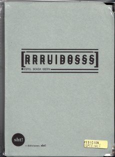
Erworben bei Michalis Pichler
TitelNummer

arcangel-working-on-my

Verfasser
Titel
  • Working On My Novel
Ort Land
Verlag Jahr
Medium

Technische
Angaben
  • [144] S., 19,7x12,8 cm, ISBN/ISSN 1846147425
    Broschur
ZusatzInfos
  • Working On My Novel is a book which is based on a twitter feed that re-tweets the best posts featuring the phrase "working on my novel."
    What does it feel like to try and create something new? How is it possible to find a space for the demands of writing a novel in a world of instant communication?
    Text von der Webseite
Stichwort / Schlagwort
TitelNummer

giddyheft-5-2009

Verfasser
Titel
  • Giddyheft - Porno für Jungs, 05. Ausgabe
Ort Land
Verlag Jahr
Medium

Technische
Angaben
  • 60 S., 21x14,7 cm, keine weiteren Angaben vorhanden
    Drahtheftung
ZusatzInfos
  • Layout von Amélie Schneider. Mit Heinz Strunk, Lecker Mädchen, Mother I#d Like to Fuck, weibliche Ejakulation, Pornowebseiten, CFNM
Stichwort / Schlagwort
WEB Link
Erworben bei Cologne Art Book Fair
TitelNummer

schierloh-waschmaschinentest-2k14

Verfasser
Titel
  • Waschmachinenfest 2K14
Ort Land

Technische
Angaben
  • 7,5x12,5x2 cm, keine weiteren Angaben vorhanden
    Musikkassette in Waschbeutel mit Reißverschluss, mit 2 Aufklebern gehalten
ZusatzInfos
  • released 08 October 2014
    Our journey through the wicked world of weird audio tapes continues with the first release of the freshly founded LIMBS-label which is the new "Waschmaschinenfest 2K14" compilation, a C30 cassette based on Field Recordings of - well... - washers. Recorded, contributed and remixed - sic! - by artists like Xotox, Klonk, Low Entropy, Jasmina, Fgnugen, Aehm and Indesit we're introduced to quite a few different types of washers e.g. ones crafted by Bauknecht, Haier, Siwamat etc. and their typical, mechanic sound patterns as well as to dark'ish Drones, haunting athmospheres and cold, scampering experimental Tribe Tekno for underground soundsystems and chemically polluted teknival scapes. Quite interesting for collectors of conceptual releases - and washers.
    Text von der Webseite
Stichwort / Schlagwort
TitelNummer

van-der-heide-cinenova

Verfasser
Titel
  • Cinenova - never done anything like it before
Ort Land
Verlag Jahr
Medium

Technische
Angaben
  • 1 S., 42x29,6 cm, keine weiteren Angaben vorhanden
    Flyer, einmal gefaltet, beidseitig bedruckt
ZusatzInfos
  • Ankündigung diverser Filmreihen und Ausstellungen, im Rahmen des Workshops der Cinenova Working Group, anlässlich der Sommerakademie Group Affinity, veranstaltet vom Kunstverein München. Beteiligte Institutionen und Gruppen: Lothringer13 Laden, Bimovie, Salong, Cinenova, Daneben
Geschenk von
TitelNummer

parked-like

Verfasser
Titel
  • Parked Like Serious Oysters - Absolventen der Städelschule 2015
Medium

Technische
Angaben
  • 21x14,8 cm, keine weiteren Angaben vorhanden
    Postkarte
ZusatzInfos
  • Im MMK 3 am 13.10.2015. Werke von 32 Absolventen aus den Klassen von Monika Baer, Peter Fischli, Douglas Gordon, Judith Hopf, Michael Krebber, Tobias Rehberger, Willem de Rooij und Amy Sillman.
Stichwort / Schlagwort
TitelNummer

trennlinie-zwischen-gesten-3

Titel
  • Trennlinie Zwischen Gesten Nr. 03
Ort Land
Verlag Jahr
Medium

Technische
Angaben
  • 24 S., 21x21 cm, 2 Stück. keine weiteren Angaben vorhanden
    Drahtheftung
ZusatzInfos
  • Zum Teil mit kryptischem Nonsense. Finally - after a long break - Munich's Best Underground Magazine Trennlinie Zwischen Gesten is back again with Volume 3. The artwork changed from A5 format to a sexy square-like individual cutting. This time the magazine is even "more arty" and includes several great german product reviews of the super-special kind. Still very obscure Pasing-scene stuff. Forget Berlin - the dead corpses walk around the Pasing Arkaden in Munich's worst district. Surely nothing for industrial listeners or other narrow-minded people. This one is for true aliens.
    Text von der Webseite
Sprache
Stichwort / Schlagwort
Geschenk von
TitelNummer

use-me-abuse-me

Verfasser
Titel
  • USE ME ABUSE ME
Ort Land
Verlag Jahr
Medium

Technische
Angaben
  • 32 S., 34x20,5 cm, Auflage: 1.000, ISBN/ISSN 9789070478285
    Drahtheftung. 2 Formate: Heft und Sticker-Buch. In Versandtasche
ZusatzInfos
  • Exhibition catalogue New York Photo Festival 2010 (12 to 16 may), curated by Erik Kessels. Catalogue designed by Angela Lidderdale.
    Use me Abuse me looks at the trend toward exploring new technology within an image-rich culture. The exhibition focused on how today’s dominance of images and image-making technology influences artists and photographers.
    Now more than ever before photographs are easy to come by, easy to make and easy to distribute. Anyone, it seems, has the freedom to do pretty much anything. This glut sees photographers experimenting with pre-existing images and using them within their work like never before.
    Text von der Webseite
Geschenk von
TitelNummer

perneczky-concepts

Verfasser
Titel
  • concepts like commentary
Ort Land
Medium

Technische
Angaben
  • 16x11,5 cm, keine weiteren Angaben vorhanden
    Einladungskarte
ZusatzInfos
  • Zur Ausstellung 29.01.24.04.2016
TitelNummer

mohr-tortuga

Verfasser
Titel
  • Tortuga
Verlag Jahr
Medium

Technische
Angaben
  • 78 S., 12,5x12,5 cm, Auflage: 500, ISBN/ISSN 978-3-937577364
    Broschur
ZusatzInfos
  • Aus der Reihe Revolverle for all ages.
    Like in a treasure book on each of the 37 photograms you will explore natural and everyday jewels.
    Text von der Webseite
Stichwort / Schlagwort
TitelNummer

1843-heft-1

Verfasser
Titel
  • The Economist 1943 Issue 01
Ort Land
Verlag Jahr
Medium

Technische
Angaben
  • 130 S., 27,5x20,2 cm, ISBN/ISSN 23972238
    Broschur
ZusatzInfos
  • The launch issue hits newsstands on March 9 with an April/May cover, and will have 120 pages. The redesigned site will go live, without a paywall, on March 7, the same day that the social accounts and the app will revert from Intelligent Life to 1843. 1843 will, like Intelligent Life before it, publish six issues a year.
    Newly appointed editor Emma Duncan has come on board from The Economist where she was deputy editor. At 1843, she leads a team of 25 across editorial and commercial, and also can pull on the wider global Economist team.
    Text von der Webseite
    A new magazine of ideas, lifestyle and culture
Stichwort / Schlagwort
TitelNummer

Verfasser
Titel
  • Fantasy of One
Verlag Jahr
Medium

Technische
Angaben
  • 4 S., 21x14,9 cm, 2 Stück. keine weiteren Angaben vorhanden
    Einladungsflyer, beiliegend ein beidseitig bedrucktes Informationsschreiben zur Ausstellung
ZusatzInfos
  • zur Ausstellung vom 21.05.-04.06.2016 im Neo Toum - Neoterismoi Toumazou, Nikosia, Zypern.
    He was dancing steadily. He could see the backs of people’s heads moving in the darkness and was aware of the shifting spaces between their bodies. He did not register the music except as a sort of vibration. He felt as if he was dancing in perfect silence. He saw the already dim room growing ever darker around him. He became less conscious of his surroundings and more aware of himself. His introspection grew but his body was now moving automatically, softly cycling through a short loop of set motions. He noticed dust under his feet, and soon the realisation reached him that he was slowly wearing a shallow hole in the wooden floor. His body was locked in an efficient cycle. Before too long he was six inches below floor level, his head parallel with some of the shorter dancers. Yet he could not stop. Gradually he sank deeper into the ground until his face was level with people’s waists. No one noticed, below the eye level of the crowd, he was almost invisible. Presently his eyes came level with the soles of dancing shoes. He could see shards of coloured light flashing through a forest of legs casting jagged shapes across the floor. There were points where soft reflected light shone through looming figures like sunlight into a clearing. Eventually he was entirely submerged. He could look up through the hole and see foreshortened bodies moving above him oblivious to his plight. Still his feet moved, wearing away damp, pungent earth. The vibrations from the music lessened until the dull thump of the kick drum was all that he could feel. When it stopped he realised he too was still, and looking up he saw the sphere of light was gone.
    Text von der Webseite
Geschenk von
TitelNummer

antipodes-10

Titel
  • antipodes 010 - No Art Move Studies
Ort Land
Medium

Technische
Angaben
  • [24] S., 21x14,6 cm, Auflage: 100, numeriert, keine weiteren Angaben vorhanden
    Drahtheftung
ZusatzInfos
  • No Art Move Studies is a postal collage collaboration by Luc Fierens (Belgium) and Brandstifter (Germany). Luc Fierens is a collagist provocateur researching the relation between word & image. He makes connections and projects with independet networks like mail-art or visual poetry.
    Text aus dem Heft
Stichwort / Schlagwort
Erworben bei Stefan Brand
TitelNummer

blad-14

Verfasser
Titel
  • B.L.A.D. NO. 14 - PERTSONAIAK
Ort Land
Medium

Technische
Angaben
  • [52] S., 13,5x9,5 cm, Auflage: 300, keine weiteren Angaben vorhanden
    Drahtheftung, Rückseite mit Metallfolienprägung, in transparenter Kunststoffhülle mit beigelegtem Blatt, Aufkleber
ZusatzInfos
  • Straight out da Basque comes the zig-zag, swish-bang drawings of a certain Mr. Zeberio. Filled to the brim with eyes like fried eggs, geometric pubic hair and ample curves, the enigmatically titled “PERTSONAIAK” is a must for any fan of cutting edge mystery-men.
    Text von der Webseite
Stichwort / Schlagwort
WEB Link
TitelNummer

piratenpresse-sometimes-i-feel-like

Verfasser
Titel
  • Sometimes I Feel Like A Motherless Child
Ort Land
Verlag Jahr
Medium

Technische
Angaben
  • [8] S., 10,5x7,5 cm, keine weiteren Angaben vorhanden
    Origami-Booklet aus Schwarzweiß-Kopien auf buntem Papier, mehrfach gefaltet und aufgeschnitten
ZusatzInfos
  • Zine der Piratenpresse
Stichwort / Schlagwort
TitelNummer

sam-connect-the-dots

Verfasser
Titel
  • Connect the dots (however you like)
Ort Land
Verlag Jahr
Medium

Technische
Angaben
  • 2 S., 11x16 cm, keine weiteren Angaben vorhanden
    Postkarte
ZusatzInfos
  • Fabrica Features is the brand communicating the ideals and creative output of the Fabrica design studio. It is defined by the attitudes and creations of the young international people who work there, refreshed by the coming and going of studio members. Their process is informed by enquiry into rituals and materials, defining a language that is thoughtful, eclectic and alternative. The focus is on conceptual objects, limited collections and prototypes, produced under the brand – which is the meeting point between the studio and the outside world. Such encounters happen in galleries, museums, online and designated Fabrica Features spaces found throughout Europe. Text von Website
Stichwort / Schlagwort
TitelNummer

velazquez-knowledge

Verfasser
Titel
  • really useful knowledge
Ort Land
Medium

Technische
Angaben
  • 300 S., 23x16,7 cm, ISBN/ISSN 9788480264990
    Klappbroschur,
ZusatzInfos
  • Ausstellungskatalog anlässlich der gleichnamigen Ausstellung im Museum Reina Sofia, Madrid vom 28.10.2014-09.02.2015.
    This catalogue investigates the notion of “really useful knowledge” and its origins. In the 1820s and 1830s, working class organisations in the UK introduced this phrase to describe a body of knowledge that encompassed various “unpractical” disciplines such as politics, economics and philosophy, as opposed to the “useful knowledge” proclaimed by business owners who had previously begun to invest more heavily in their companies’ progress through financing workers’ education in “applicable” disciplines like engineering, physics, chemistry and mathematics. The publication presents texts and conversations that analyse these themes, including philosophy, art, politics and technology.
    Mit Texten von u. a.: What, How & for Whom, Marina Garcés, Raqs Media Collective, Luis Camnitzer, Trevor Paglen, Jacob Appelbaum, Fred Moten & Stefano Harney und G.M.Tamás.
    Text von Website
Sprache
Geschenk von
TitelNummer

westphal-songs

Verfasser
Titel
  • songs that changed everything
Ort Land
Verlag Jahr
Medium

Technische
Angaben
  • 46 S., 17,5x17,5 cm, Auflage: 200, numeriert, 2 Stück. keine weiteren Angaben vorhanden
    Drahtheftung, mit Pergamentpapier, 2farbige Risographie und Farblaserkopie, in transparenter Kunststoff-Schutzhülle,
ZusatzInfos
  • We all have songs that left a mark, that changed the way we thought about music, about life, that helped us make new friends, that set something in motion. We wanted to collect these songs, and especially the stories behind them, from people that we know and like. This zine contains written pieces (in Englisch and German), as well as images, done by 13 wonderful people.
    Text aus dem Heft
Sprache
Stichwort / Schlagwort
TitelNummer

bast-fook-1
bast-fook-1
bast-fook-1

Yiaxi Natalie: bast fook 01, 2016

Verfasser
Titel
  • bast fook 01
Verlag Jahr
Medium

Technische
Angaben
  • [28] S., 21x13,8 cm, Auflage: 60, numeriert, keine weiteren Angaben vorhanden
    Fadenheftung, auf farbige Papiere gedruckt,
ZusatzInfos
  • Bast Fooks was one of my new years resolutions for 2016. I haven’t given up smoking yet, but I did end up spending my new years eve in, printing and sewing the first Bast Fook issue. There and then I had decided that it would be a project in 12 parts and that I would produce a book for each month of 2016. Each Bast Fook is a repository of ideas (in the form of notes, thoughts, readings and misreadings, assumptions, aphorisms, contemplations, stories, lists, observations and lost projects). Bast Fooks have evolved into a platform through which, I can organise - in a pretty disorganised way-ideas as they happen and material produced in different ways, under different circumstances, at different places and times and sometimes by totally different versions of myself. Bast Fook is an anagram of Fast Book and in a way each issue is offering a slow consumption of a fastness that often reads a lot like a facebook newsfeed, decentered, fragmented, multivoiced.
    Text von der Website
Sprache
Stichwort / Schlagwort
TitelNummer

peaceable-kingdom

Titel
  • Peaceable Kingdom
Ort Land
Verlag Jahr
Medium

Technische
Angaben
  • [36] S., 22,5x16 cm, ISBN/ISSN 978-3-905714371
    Broschur, Softcover, Farbdruck
ZusatzInfos
  • Peaceable Kingdom is the first book of collaborative work by the two American artists Chris Johanson and Jo Jackson partners in life and art. All paintings feature a mix and match of both artists' styles, from Johanson's political, social themes and color patterns, to the oneiric, provocative and ambiguous side of human identity represented by Jackson's softer tones. Each painting being none like the other, and showing an incredible combination of shapes, forms, colors and ideas through a fascinating imaginary world, almost childlike.
    Text von der Website
Stichwort / Schlagwort
WEB Link
TitelNummer

bonnet-whose-heritage

Verfasser
Titel
  • Whose Heritage? - Floorplan Papers
Ort Land
Verlag Jahr
Medium

Technische
Angaben
  • 252 S., 19x13,5 cm, Auflage: 500, ISBN/ISSN 978-3-931184087
    Broschur
ZusatzInfos
  • Whose heritage are we dealing with? With this one-day conference, we want to create an overview of the contemporary discussions on museums dealing with old and new formats of heritage. The morning session has been set up as an informal “World Café”. In this interactive format, the guests are invited to address pertinent topics such as transnationality, transculturality, shared heritage, intellectual property, “Deutungshoheit”, restitution, museological concepts & categorisations and the management of meaning in art and culture. In the afternoon, the conference will bring together honourable guests from the academic and practical museum-fields. The podium is not only dedicated to aspects of how to deal with/handle/encounter so called “other” cultures but also in addressing questions of our own cultural and intellectual heritage. We would like to encourage the audience to participate in the debate.
    Text von der Webseite
Sprache
Stichwort / Schlagwort
Geschenk von
TitelNummer

dncht-16

Verfasser
Titel
  • dncht #16 - Magazine for Photography, Design und Subculture
Ort Land
Medium

Technische
Angaben
  • 128 S., 18x15 cm, Auflage: 1.000, numeriert, ISBN/ISSN 18681506
    Klebebindung
ZusatzInfos
  • So, here we are again. dienacht is not just a portfolio magazine, but also a personal project. That's why some personal circumstances lead to the fact that this issue is released much later as it should have been – but now it's here, on the last days of the year 2014!
    We have, once again, outstanding photographers and artists, like Birgit Krause and her out-of-this-world-series "Pláně.tes", Jean-Marc Caimi showing a selection from "Daily Bread", Zhe Chen and her painfully intimate diary "The Bearable", the funny childhood memories translated into photography by Vendula Knopová, Magdalena Sawicka's raw but precise illustrations, Elena Montemurro's "Coming of Age" (which is also this issue's cover story) and many more incredible photographers and photobook reviews.
    Text von der Webseite
Sprache
Stichwort / Schlagwort
Geschenk von
TitelNummer

TAM-TAM-Tanz-Scheiben

Stadler Matthias / Funk Hardy, Hrsg.: TAM TAM Tanz Scheiben, 2017

Verfasser
Titel
  • TAM TAM Tanz Scheiben
Ort Land
Verlag Jahr
Medium

Technische
Angaben
  • 31,5x31 cm, Auflage: 200, 2 Teile. keine weiteren Angaben vorhanden
    2 Langspielplatten in Klapphülle
ZusatzInfos
  • Mit einem Text von Daniel Door.
    Die ursympathische, trinkfeste und gern auch mal alberne Doppel-LP des TAM TAM Tanzlokals (aka Kammerspiele Bar) in München. Eine Platte, die gut zuhören kann und dich versteht. Eine Platte, die für jeden Spaß zu haben ist. Die mit dir bis zum nächsten Morgen in den dreckigsten Clubs der Stadt tanzt. Und die mit dir genauso gern raus an den See fährt und Kirschen isst.
    Zwei Platten mit Tracks und Songs von den DJs und Bands, die das TAM TAM Tanzlokal in seinem ersten Jahr zu einem unverwechselbar offenen, verrückten, partyhungrigen, allesistmöglichen, duweißtniewaspassierten Ort gemacht haben.
    released July 21, 2017
    Text von der Webseite
Sprache
Stichwort / Schlagwort
Erworben bei Matthias Stadler
TitelNummer

Kryptyka-Julia-Strauss

Verfasser
Titel
  • Krytyka Polityczna Athens
Ort Land
Verlag Jahr
Medium

Technische
Angaben
  • 272 S., 23,5x16,5 cm, signiert, ISBN/ISSN 16440919
    Broschur, mit Widmung, gefaltetes Blatt eingelegt, Cover manuel bearbeitet, mit Glitzer
ZusatzInfos
  • Dear Reader,
    In your hands is the Athenian issue of Krytyka Polityzcna. The Warsaw-based journal unites polymorphous freedom struggles in geographic Europe. This book is an anarchist, anti-capitalist, anti-fascist artwork. A hypothesis, and yet one that continues to be written actively on the ground. It clashes migration and education of the status quo, the effect and the cause of current violence.
    The publication documents an initiative, Universitas*, and accompanies the forthcoming Symposion, The School of Everything.
    This book contains the contributions of people who have recently moved to Athens from the Middle East, of Athenians who have lived here a long time, as well as of those who are based in Berlin but frequently visit Athens. brought together, they form a de-elitized and de-colonized remix of knowledge.
    The chapters in this book are intertwined and in each part the reader will find contributions relevant to the whole. The authors are all united by their portrayal in anti-phrenological drawings.
    In Athens, despite the invention of the State, streams of interlapping cultural influences never stopped pulsating. Such an experience of fluid identity de­monstrates that citizenship is an outdated concept of class separation and nationalism. The devastating contradiction: human rights are only valid in the economically privileged zones. The failure to collaborate with the revolution in Syria dispels the last illusions of an occidental civilization and unveils the truth: we all live in the absolute financial dictatorship.
    This publication includes several essays and statements on education. These are written by thinkers, philosophers, “activists”, and artists who are affili­ated with the Avtonomi Akadimia, a disobedient grassroots university in Athens which claims education as a form of art. These texts, poems, mani­festos and sketches of educational models are published in lieu of the abs­tracts for an upcoming Symposion entitled: “The School of Everything”.
    We build an educational system which consists of indignant initiatives for sharing knowledge, and of proposals by thinkers who see education as key. We shift from learning to sharing. We decriminalize sharing because we would like to enjoy the pleasure of giving. We liberate ourselves from the strictures of “Homo Sapiens”, a construct imposed upon life.
    We will transform the educational system of Europe.
    The clash of migration and education will release a Promethean fire.
    Text von der Webseite
    In collaboration with aneducation and the Public Programs of documenta 14
Sprache
TitelNummer

francesco-neo-visitenkarte

Verfasser
Titel
  • Art like an italian proudly imperfect - imperfect but ingenious
Ort Land
Verlag Jahr
Medium

Technische
Angaben
  • 2 S., 11x15x1 cm, keine weiteren Angaben vorhanden
    Visitenkarte aus Schichtholz, beidseitig bemalt und besprüht
ZusatzInfos
  • Verteilt auf der Vernissage von Kunstsalon 2017, im Ägyptischen Museum, Kunstareal München, Arcisstr. 16 am 08.11.2017
Sprache
Geschenk von
TitelNummer

Paper

Verfasser
Titel
  • Paper
Verlag Jahr
Medium

Technische
Angaben
  • 44 S., 39x55 cm, Auflage: 500, numeriert, 2 Stück. keine weiteren Angaben vorhanden
    Blätter lose ineinader gelegt, Anschreiben beigelegt
ZusatzInfos
  • One would like architecture to be a stable ground, a fixed set. It would be reassuring to feel that the bakery of our childhood is still here, that the building we used to pass by everyday will be standing here forever. But behind the certainty of a brick wall or a concrete slab stands the uncertainty of its use, its life, its inhabitation, its domestication. Impossible to predict, this softness invites us to think architecture as a frame, an open structure, a malleable playground.
    Paper is a newspaper focusing on Common places in Beijing. Paper investigates the multiple forms of inhabitation at the smallest scale, as accidents within a given structure. Paper focuses on the non-monuments constitutive of the city of Beijing. It unfolds 43 photographs taken in Dong-Cheng District, and a bilingual text in English and Chinese. Paper was firstly launched on the 27th of October during a solo show exhibition 'Common places' at the Institute for Provocation.
    Text von der Webseite
Sprache
Stichwort / Schlagwort
Erworben bei Iris Lacoudre
TitelNummer

radic-the-message

Verfasser
Titel
  • Poruka - The Message
Ort Land
Verlag Jahr
Medium

Technische
Angaben
  • 124 S., 12x24 cm, ISBN/ISSN 9789535875505
    Broschur
ZusatzInfos
  • Katalog zum gleichnamigen kollaborativen Ausstellungsprojekt, das zwischen 2012 und 2014 in Berlin und Kroatien stattfand.
    The starting point was a simple, large scale, spatial installation similar to the abstract works I have been doing after leaving the academy in the 90s. Once the initial installation was built, the first visitor was invited to look at the piece and give her interpretation of the work. I then changed the installation to make it, in my opinion, appear more like the interpretation I have just heard. The process was repeated some thirty times with different people invited. The visitors were of different age, professions and backgrounds, but were all professionals from the contemporary art scene.
    Text von der Webseite.
Sprache
Geschenk von
TitelNummer

Kampka Marina: weather forecast 2, 2015

kampka-weather-forecast-2

Kampka Marina: weather forecast 2, 2015

Verfasser
Titel
  • weather forecast 2
Ort Land
Verlag Jahr
Medium

Technische
Angaben
  • [224] S., 23x15,2 cm, ISBN/ISSN 978-1-908452610
    Paperback mit Klebebindung, Blätter rückseitig in Spiegelschrift bedruckt, so dass sie durch das dünne Papier lesbar sind.
ZusatzInfos
  • a non-complete and subjective collection of english weather forecasts- edited out of 28 random newspapers during 4 ifferent London visits betweem october 2012 and september 2013. read in those small excerpts, the english weather appears like poetry. this book is a twin. whereas weather forecast (1) shows the "weather poems" one after another, page by page, black on white, weather forecast (2) uses the book format differently: every "poem" is printed side-inverted on the backside of front page. due to transparency of the paper, the text can be read "through" the page. every "weather poem" also exists as fine hand letterpressed sheet in A4 format.
    Text von der Webseite.
Weitere
Personen
Sprache
Erworben bei Lulu.com
TitelNummer

the-archive-of-digital-art-pk

Verfasser
Titel
  • The Archive of Digital Art ADA - The Archive of Digital Arts goes Web 2.0!
Ort Land
Medium

Technische
Angaben
  • 8,8x21 cm, keine weiteren Angaben vorhanden
    Infokarte
ZusatzInfos
  • As a pioneer in the field of Media Arts research, the ARCHIVE OF DIGITAL ART (ADA) documents the rapidly evolving field of digital installation art for more than a decade now. This complex, research-oriented overview of works at the intersection of art, science, and technology has been developed in cooperation with international media artists, researchers and institutions, as a collective project.
    Since todays digital artworks are processual, ephemeral, interactive, multimedia-based, and fundamentally context dependent, because of their different structure, they require a modified, we called it an ‚expanded concept of documentation‘. ADA represents the scientific selection of 500 international artists of approx. 5.000 evaluated artists. We ascribe high importance to artistic inventions like innovative interfaces, displays or software.
    Text von der Webseite
Sprache
Erworben bei documenta archiv
TitelNummer

36_markus_burke
36_markus_burke
36_markus_burke

Burke Markus: No money no pines, 2017

Verfasser
Titel
  • No money no pines
Ort Land
Medium

Technische
Angaben
  • 106 S., 21x14,8 cm, Auflage: Print on Demand, 2 Stück. keine weiteren Angaben vorhanden
    Broschur
ZusatzInfos
  • Schwarz-Weiß-Drucke, Nr. 036 aus der Reihe 100for10
    Markus Burke was born in 1978. He studied photography at the University of Applied Science in Munich. Since his graduation in the year 2007 he lives in Munich and works everywere as freelance photographer. He photographs for Magazines like SZ Magazine, NEON, Vice, Musikexpress, FRAME, GQ etc. and doing music videos for Gomma Records.
    Text von der Webseite.
Sprache
Geschenk von
Erworben bei Melville Brand Design
TitelNummer

70_simon_lohmeyer
70_simon_lohmeyer
70_simon_lohmeyer

Lohmeyer Simon: Nothing tastes quite like it, 2017

Verfasser
Titel
  • Nothing tastes quite like it
Ort Land
Medium

Technische
Angaben
  • 106 S., 21x14,8 cm, Auflage: Print on Demand, keine weiteren Angaben vorhanden
    Broschur
ZusatzInfos
  • Schwarz-Weiß-Drucke
    Simon Lohmeyer was born and raised in Munich. After he finished school he worked as an self-employed photographer in Cape Town, New York, Mexico, London, Mailand, Paris and Sydney. Since 2015 Simon is lifestyle photographer and blogger for GQ.
Sprache
Stichwort / Schlagwort
Geschenk von
Erworben bei Melville Brand Design
TitelNummer

75_felix_bork
75_felix_bork
75_felix_bork

Bork Felix: Quit playing games with my fart, 2017

Verfasser
Titel
  • Quit playing games with my fart
Ort Land
Medium

Technische
Angaben
  • 106 S., 21x14,8 cm, Auflage: Print on Demand, keine weiteren Angaben vorhanden
    Broschur
ZusatzInfos
  • Schwarz-Weiß-Drucke
    Felix Bork is a nearly 30-year-old, Berlin-born illustrator. In his work he sets appart the really important things in life. Like sugar-free nutrition, cute animals, flatulence and love. He graduated from his Masters in ATAK’s Illustration class in 2016. His graduation work, a field guide about native animals, will be published in 2017. He has illustrated several self-published books and zines and has not worked for clients such as Nike, L’Oréal, Mercedes Benz, New York Times or Beyoncé.
Sprache
WEB Link
Geschenk von
Erworben bei Melville Brand Design
TitelNummer

76_kid_richards
76_kid_richards
76_kid_richards

Richards Kid: II, 2017

Verfasser
Titel
  • II
Ort Land
Medium

Technische
Angaben
  • 106 S., 21x14,8 cm, Auflage: Print on Demand, keine weiteren Angaben vorhanden
    Broschur
ZusatzInfos
  • Schwarz-Weiß-Drucke
    My name is KID, I’m 28 and I’m based in Lisbon, Portugal.I’m a Rock’n’roll musician, and studied Architecture for 4 years. Around 3 years ago, I became a photographer. Since that, I mainly shoot with film – 35mm, medium format, polaroid and instant film, and others. Photography is one of the most amazing and beautiful ways to express yourself, as diary or editorial. I really like to be able to tell some story with a photo, or to create some emotions with it. With photography, we are able to keep a moment forever.
Sprache
Stichwort / Schlagwort
Geschenk von
Erworben bei Melville Brand Design
TitelNummer

90_mike_perry
90_mike_perry
90_mike_perry

Perry Mike: Stoned marker in houston w / Chris, 2018

Verfasser
Titel
  • Stoned marker in houston w / Chris
Ort Land
Medium

Technische
Angaben
  • 106 S., 21x14,8 cm, Auflage: Print on Demand, keine weiteren Angaben vorhanden
    Broschur
ZusatzInfos
  • Schwarz-Weiß-Drucke
    Mike Perry makes paintings, animation, sculptures, books, public art installations, monographs, exhibitions, drawings, silkscreens, and more. His creative purpose is to conjure that feeling of soul-soaring wonder you have when you stare into distant galaxies on a dark night, when you go on long journeys into the imagination, when you ponder what it is that this life is all about. In so doing, he celebrates form: of the human body, of shapes and lines that coalesce into lyrical masses, of the vastness of the cosmos and the questions it calls us to. In Mike’s patterns, portraits, and dreamscapes, there are layers upon layers of meaning, some erased, some covering, some asking you to look deeper, some no longer there but still vibrating with a story that sought not to be forgotten. His use of color, pattern, and form, at times child-like, expresses a joyful spirit and a reverence for the bliss that is inherent in the human experience.
Sprache
Stichwort / Schlagwort
Geschenk von
Erworben bei Melville Brand Design
TitelNummer

zabel_frauke_gender2018_2

Verfasser
Titel
  • Gender Studies in Architecture - Performativity – The relationship of public and protected space
Ort Land

Technische
Angaben
  • 20x40 cm cm, 10 Teile. keine weiteren Angaben vorhanden
    Konvolut mit Heften/Zines unterschiedlicher Formate A6-A5 in Plastiktüte des Lenbachhaus mit Applikationen aus farbigem, geschnittenem Tape und Geschenkband. Teils Collage von ausgedruckten Fotos auf Transparentpapier, Fold-outs, gezeichnete u. geklebte Karten, übereinandergedruckter e-mail-Verkehr zum Seminar, Ausdruck des Seminarprogramms, als Binde um das Konvolut. Handschriftlicher Begleitbrief
ZusatzInfos
  • Produziert zum Seminar von Frauke Zabel an der TU München, Oktober/November 2018. In diesem Rahmen auch Besuch im AAP am 03.11.2018.
    Based on an observation of public, semi-public and commercial spaces in which we move in Munich today, the seminar takes a look at the regulation of the public space (gender construction and repression of political opinions) in different times and cultures. We will consider various counter cultural movements in their emergence in relation to the public space of the respective time. Why do counter cultural movements withdraw from the public space into protected spaces and imitate a form of reality in them? We will look at the development of Brazilian theater under military dictatorship in the 1960s in Brazil by examining two architectural examples. The imaginative space of the theater, in which the reality is put into negotiation, will be regarded in relation to the imitation of the public space in the Ballroom culture of the 1980s in New York. There people were able to perform and to imitate (gender) roles, which the society did not provide for them. These historical references are complemented by a consideration of the current LGBTQ+ movement in different locations worldwide and their relationship to the public space. What are the moments that engage counter cultural movements to move in public space to gain visibility? We will look at examples like invisible theater, artistic processions, performances, parades and manifestations.
    Text von der Webseite
Sprache
Geschenk von
TitelNummer

tgm2018

Verfasser
Titel
  • You're my type - Programmbuch 2018
Ort Land
Medium

Technische
Angaben
  • 20,5x13,5 cm, keine weiteren Angaben vorhanden
    4 Bände in Schuber. Schuber geprägt in Gold und Schwarz, Rückseite mit Umkehr der Farben. einzelne Cover mit Reliefprägung, geometrische Formen, Farbschnitt schwarz. Einzelne Bände in Schweizer Broschur (Umschlag nur auf Rückseite angeklebt, Rücken mit Gewebestreifen eingefasst). Bd. 1 130 S., letzte Seite mit Kalender als Fold-Out. Bd. 2 160 S., Bd. 3 96 S., Bd. 4 Blindband, (Notizbuch), 72 S.
ZusatzInfos
  • The Typographic Society Munich is the largest organisation in Europe for typographers and people who are interested in typography and design. Since being founded in 1874 the designers’ club establishes a foundation for sophisticated and interdisciplinary thinking and dialogues among content and form, text and photo, tradition and innovation, design and technology. The tgm represents quality and education for the branch of communication and offers a huge accompanying training program. As Chairwoman of the club I curated several lectures in the last years, inviting design and typography celebrities.Throughout the years designers like Stefan Sagmeister, Mirko Borsche, Eike König, Mario Lombardo, Sascha Lobe, Fons Hickmann, Amir Kassaei or Kurt Weidemann to name a view, followed these invitations and appreciated the warm welcome of our community.
    To show the wide range of offerings we traditionally create a yearbook. More over I tried to give the content based complexity of our proposal a clear and neat arrangement. Therefore the new release is a compilation of four different books, which should invite the reader to inform themselves, to browse, to experience and to participate. The first one exposes all the topics, facts and dates for the further education programs. Part two presents all the people and their stories who are involved in the club, who are on stage and behind the scenes. The third book is a journey into the past and also the future of tgm’s conferences, excursions and other specials. And finally there is room for the reader’s own ideas, experiences and criticism as a foundation for a future dialogue with tgm.
    Every offer under the roof of tgm is a result of solidarity. It is a result of people and companies who are united by the common interest in typographic quality. This project has only been possible with the support of Kösel Druck GmbH & Co Kg, Geese Paper, mycolorserver and the collaboration with Boah Kim.
    Text von der Webseite
Weitere
Personen
Sprache
TitelNummer

monok-gamper

Verfasser
Titel
  • MONO.KULTUR #32 Martino Gamper - All Channels Personal
Ort Land
Verlag Jahr
Medium

Technische
Angaben
  • 56 S., 20x15 cm, ISBN/ISSN 18617085
    Drei Hefte in verschiedener Größe broschiert, mit Drahtheftung
ZusatzInfos
  • Martino Gamper is the kind of product designer we all have been waiting for: Brimming with ideas, energy and humour, his designs are disarmingly irreverent and irresistibly fun, and unlike anything one will see in the puristic galleries of contemporary design. Crossing over from studying sculpture to completing an MA in product design at the prestigious Royal College of Art under Ron Arad, Gamper has had little time to worry over the theoretical do’s and don’t’s of his profession – instead, he has followed a simple rule of learning by doing, meaning: the more you do, the more you learn. With mono.kultur, Martino Gamper talked about his idea of fun, why a chair is the ultimate challenge and what design has in common with cooking. Visually, the issue is bursting with references and ideas, reclaiming image material from left and right, while unveiling the structure of a book with three booklets of different sizes all lovingly assembled into one – and manually at that, which makes for some rough edges or rather what we like to call extra personality.
    Text von der Website.
Weitere
Personen
Sprache
Stichwort / Schlagwort
WEB Link
TitelNummer

monok-edmund-waal

Verfasser
Titel
  • MONO.KULTUR #40 Edmund de Waal - W is for White
Ort Land
Verlag Jahr
Medium

Technische
Angaben
  • 44 S., 20x15 cm, ISBN/ISSN 18617085
    Drahtheftung, auf verschiedenem Papier gedruckt
ZusatzInfos
  • Edmund de Waal is a potter. His pots, plates, and vessels are the result of craft and mastership, but they are also so much more than that: they are experiments in form and function, abstractions of thoughts on silence and space, on repetition and failure, on substance and fragility, on memory contained. Edmund de Waal is an artist. He arranges his objects in complex choreographies that are as mysterious as they are mesmerizing. Displayed in galleries and institutions worldwide, his considered installations play with architectural concerns, integrating ideas of space, light and obscurity. Edmund de Waal is a writer. Whether he sculpts with words or with clay, what Edmund de Waal works with are concepts, ideas, and desires. In a body of work that is at odds with our times and yet oddly successful, his writings and objects overlap and integrate each other in an attempt to understand and transcend our complex relationship with objects and our surroundings. In an interview with mono.kultur structured like an A-Z of notes and ideas, Edmund de Waal talked about his rules of attachment, the impossibility of repetition, and why ‘doubt’ is the most beautiful word. Visually, the issue takes inspiration from that most perfect of materials: porcelain. Printed entirely in double-sided splendour, the two finishings of the paper – shiny gloss and smooth matt – evoke the texture of ceramics before and after glazing.
    Text von der Website.
Weitere
Personen
Sprache
Stichwort / Schlagwort
TitelNummer

monok41-stuart

Verfasser
Titel
  • MONO.KULTUR #41 Meg Stuart - Make the first move
Ort Land
Verlag Jahr
Medium

Technische
Angaben
  • 48 S., 20x15 cm, ISBN/ISSN 18617085
    Drahtheftung, auf verschiedenen Papieren gedruckt
ZusatzInfos
  • Meg Stuart’s work is not about the elegance and beauty of dance, or at least not in the conventional sense. It is about exploring the outer edges of movement, where bodies age, fail, and surrender, where individual spaces disintegrate and bleed into each other, where physical memories are exposed like open wounds. Meg Stuart’s work is located at the vanishing point where dance meets visual arts. Within just two decades, Stuart’s dance company Damaged Goods, which she founded in 1994, have produced a lengthy and diverse list of projects, ranging from countless full-length feature works to multi-disciplinary dance installations, improvisations, and films that spread far beyond the theatre stages of the world, into museum spaces, film festivals or the wide open street. With mono.kultur, Meg Stuart talked about her first physical memories, the healing power of dancing and the thrill of disorientation. Following Meg Stuart’s interest in abundance and complexity, the design discards all notions of top or bottom, left or right, with text and images set in different and ever-changing directions. A magazine as a physical object that wants to be handled and turned. Reading as a dance.
    Text von der Website.
Weitere
Personen
Sprache
Stichwort / Schlagwort
TitelNummer

werner_surfer

Titel
  • Surfer (EISBACH). A Photographic Sketchbook by Heike Werner with Philosophical Meditations by Peter Kreeft
Ort Land
Verlag Jahr
Medium

Technische
Angaben
  • 112 S., 19,5x26 cm, ISBN/ISSN 978-3-980947169
    Broschur, Digitaldruck
ZusatzInfos
  • Surfer (Eisbach) ist ein ungewöhnlicher Bildband zum Thema Surfen. Es ist ein fotografisches Skizzenbuch, das mit seinen experimentellen Aufnahmen einen überraschend neuen, geradezu poetischen Blick auf das Surfen zeigt. Begleitet werden die skizzenhaften Bilder der Eisbach-Surfer von den philosophischen Betrachtungen des amerikanischen Autors und „surfanatics“ Peter Kreeft, der über das einmalige Surferglücksgefühl und die mystische Seite des Surfens schreibt. Der Text der vorliegenden Ausgabe ist zweisprachig, auf Englisch und Deutsch.
    Surfer (Eisbach) is an unusual collection of pictures on surfing. With its experimental pictures, it is a photographic sketchbook that shows a surprisingly new and refreshingly poetic view of surfing. The sketch-like pictures of the Eisbach surfers are accompanied by philosophical considerations of American author and “surfanatic” Peter Kreeft, who writes about the unique sensation of joy experienced by surfers and the mystic side of surfing. The text of this book is bilingual, appearing in English and German.
    Text von der Webseite
    Vergriffen lt. Webseite
Sprache
Stichwort / Schlagwort
Geschenk von
TitelNummer

Grau Max: ruine 03 – You see I've Always Wanted Things To Be Beautiful, 2018

rm3-maxgrau
rm3-maxgrau
rm3-maxgrau

Grau Max: ruine 03 – You see I've Always Wanted Things To Be Beautiful, 2018

Verfasser
Titel
  • ruine 03 – You see I've Always Wanted Things To Be Beautiful
Ort Land
Medium

Technische
Angaben
  • 84 S., 18,3x13 cm, Auflage: 70, numeriert, 3 Teile. ISBN/ISSN 978-3-947250103
    Broschur, Schwarz-Weiß-Digitaldruck, beigelegt ein gefalteter Flyer, zusammen in gefaltetem Blatt A3 mit Prägedrucken
ZusatzInfos
  • Zum Release und zur performativen Lesung in der Lothringer 13 florida in München am 01.03.2018 um 20 Uhr.
    Ruine München is happy to presents Max Grau's first artist book ever. In his words: "I’m really happy with how the book turned out. It looks and feels pretty. It has 84 pages and contains 53.260 characters (incl. spaces). There’s 25 images spread out over six chapters (which have names of varying length). The whole thing is titled after a line from a Frank O’Hara poem that I really like (although I’m not quite sure if I »get« it). There’s footnotes and page numbers and even a topic (optimism. Sort of). The text is written in English and the book is covered in a beautiful sleeve, designed by Maria (I think). It (the sleeve) contains a very flattering text (in German) about… uhm… me, written by the whole RUINE gang. Every issue is numbered and since there wasn’t a ton of money (why is there never an actual ton of money?), we only printed an edition of 70."
    Text von der Webseite
Weitere
Personen
Sprache
Stichwort / Schlagwort
Erworben bei Z Common Ground
TitelNummer

mccarthy-how-to-start-a-revolution-book

McCarthy Anna: How to Start A Revolution – The Musical, 2018

Verfasser
Titel
  • How to Start A Revolution – The Musical
Verlag Jahr
Medium

Technische
Angaben
  • [300] S., 28,5x21,3 cm, Auflage: 100, numeriert, signiert, keine weiteren Angaben vorhanden
    Hardcover mit Schnürsenkel verschlossen, Digitaldruck, 11 eingelegte Risodrucke, gedruckt bei Extrapool/Nijmegen, mit handschriftlicher Widmung
ZusatzInfos
  • So what was it like before everything went hell-bent batshit crazy? Enter Prof. Dr. of Pseudology, Anna McCarthy, with her HOW TO START A REVOLUTION book and its endless footnotes and twists and turns. She explains to us the chronology of politics and personal occurrences through this haze of a microcosm.
    HOW TO START A REVOLUTION is a multi-layered work that deals with clichés of rebelliousness. It is embedded in socio-political events from 2007 to 2015 and their mediated and subjective reception. It deals with rebellion in limbo, in which change seems ominent, mirroring the current political atmosphere. Geographically anchored in Munich and Bavaria, it reaches beyond the local peculiarities and relocates them into the context of historical global events. A microcosm of reoccuring people and places stand in as exemplary figures for global events in a humorous, absurd, and critical manner. Examples are documentaries such as 'Bored Rebel in Oberpfaffenhofen' or ridiculously provocative political actions in public spaces, numerous "in-flux" archives, a pathetic musical, which was first performed in 2013 at Haus der Kunst, and even a permanent installation in Tito’s ex-Bunker in the hills of Bosnia and Herzegovina.
    The project has been exhibited internationally, including at Nottingham Gallery for Contemporary Art, Chisenhale Gallery London, Schloss Ringenberg, Galleribox Akureyri Iceland, Goethe University Frankfurt, D-0 Ark Underground, Konjic, and at Transmission Gallery in Glasgow, amongst other locations. ...
    Text von der Website
Weitere
Personen
Erworben bei Edition Taube
TitelNummer

zoete_according_2018

Verfasser
Titel
  • To Be Determined - According to the Situation
Ort Land
Medium

Technische
Angaben
  • 184 S., 24x16,5 cm, ISBN/ISSN 978 88 6749 351 7
    Broschur mit Klappen; Einband mit aufgeprägtem Foto, Papier Einband mit textilähnlicher Struktur, Vorsatz/Nachsatz bedruckt mit Foto schwarzweiß, innen verschiedene Papiersorten für Fotos, Texte und Zeichnungen. Druck: Tipografia Valdostana
ZusatzInfos
  • Erscheint zur Ausstellung im S.M.A.K., Gent, Belgien,11.03-04.06.2017.
    "Welcome to the world of Dirk Zoete. Because that’s what his work is: a conceived universe. The way someone leaning over a table makes a plan and imagines the world. While technology takes us into several intangible dimensions with virtual reality and other applications, Zoete makes us believe the world is still flat. Everything seems to have only a front and a back. As if we still believed that the earth is just a disk, and we can fall off. Zoete’s drawings are clumsy, intermittent, naive, adventurous, simple. It’s like a child’s imagination, depicting in a heap what you otherwise cannot fit on a piece of paper." Philippe Van Cauteren. Published in occasion of his first major solo exhibition in a Belgian museum, To be determined. According to the situation, held at S.M.A.K. in Gent in 2017, this catalogue explores Dirk Zoete’s peculiar practice. Enriched by essays and texts by Philippe Van Cauteren, Stephan Berg, Koen Peeters and Ann Hoste, the book is a journey through the artist’s process—who, starting from a drawing, generates models, sculptures, architectural constructions, photos, films. An all-encompassing approach that makes the Belgian’s work outstand as a natural successor of the German Bauhaus and Russian Constructivism, but with a more human touch.
    The catalogue features a wide selection of images, presenting the many different stages of transformation of a drawing into a three-dimensional piece, and the hybrid nature of the exhibition set-up, a mix of a museum show and an artist’s studio, both essential characteristics of Zoete’s art."
    Text von der Webseite
Weitere
Personen
Stichwort / Schlagwort
Geschenk von
TitelNummer

enik-the-deapest-space-of-now-2020

Enik: Album #01 - The Deepest Space of Now, 2019

Verfasser
Titel
  • Album #01 - The Deepest Space of Now
Ort Land
Medium

Technische
Angaben
  • 31x31,4 cm, Auflage: 100, numeriert, keine weiteren Angaben vorhanden
    Schallplatte in schwarzer Papierhülle, 2 Einzelblätter, Umschlag, alles zusammen in bedruckter transparenter Kunststoffhülle mit zwei zwei Papierklebestreifen verschlossen
ZusatzInfos
  • Limited Gold Vinyl Edition of 100 vom 13.12.2019.
    There's not much in the world that is more exciting than a record label's album release number one. If you feel about music like we do, then you will most probably agree. This sets a tone and foundation and we are very excited about this album being our #01. After many collaborations and work as producer, composer for famous artists, this now is ENIK's 4th official solo album and his first solo album in years. The Deepest Space of Now is a truly unique and trippy soundtrack.
    Text von der Webseite
Sprache
Stichwort / Schlagwort
Erworben bei Enik
TitelNummer

buttmann_schlantz_2019

Buttmann Verena: DIE SCHLANTZ, DIE KURED, DIE KON, 2019

Verfasser
Titel
  • DIE SCHLANTZ, DIE KURED, DIE KON
Ort Land
Verlag Jahr
Medium

Technische
Angaben
  • 19x19 cm, Auflage: 200, ISBN/ISSN 978-3-948200022
    Schallplatte (7 inch) in Hülle mit Umschlag und Beiheft, geklammert, in Klarsichthülle. Mit beigelegten Zetteln mit aufgedrucktem Downloadlink
ZusatzInfos
  • ”Hhhh Minne, off you go, she’s coming! The deadline is in 5 minuties. If the Mayonnage hears that I’m only just starting. Woah my heart is catching fire. Close the curtain, yes.“ As the mayonnage approaches, the excitement grows. Without ever taking on a tangible form, her presence in Verena Buttmann‘s audio piece „Die Schlantz, die Kured, die Kon” (The Slutch, The Khored, The Quee) lies above everyday events. The mayonnage is many things: the object of fear, the last salvation, the state of oppression, the bridge to a remote world or a dreamlike projection. On her record, the artist Verena Buttmann creates a social cosmos between theatre-like staging and private space. A dialogical poem and a scenic piece of music reveal a narrative that follows a peculiar temporal dimension and linguistic logic. Verena Buttmann takes language to the edge of meaning, where its musical quality unfolds. The publication contains a 7‘ inch vinyl record, a brochure with the original text in German and the English translation, as well as a download link.
    Text von der Webseite
Weitere
Personen
Sprache
Stichwort / Schlagwort
Geschenk von
TitelNummer

claus_juergen_oceans_2020

Claus Jürgen: To the Oceans with Imagination. Planet Ocean as Medium and Culture, 2020

Verfasser
Titel
  • To the Oceans with Imagination. Planet Ocean as Medium and Culture
Ort Land
Medium

Technische
Angaben
  • 96 S., 22,5x16,5 cm, signiert, keine weiteren Angaben vorhanden
    Broschur mit Klappen. Signiert S. 95 "Ex. 45 / 2020. Cover und Innenteil in Blau. Beiliegend ein Inkjetausdruck mit handschriftlichem Gruß. In Umschlag aus goldener Luftpolsterfolie.
ZusatzInfos
  • Erscheint anlässlich von Jürgen Claus' 85. Geburtstag. Mit Text von Frieder Nake: The Revolutionary must be like a Fish in Water. A Remark for Jürgen Claus.
Sprache
Geschenk von
TitelNummer

fluxus-on-demand-022

Brandstifter (Brand Stefan), Hrsg.: Flux on Demand 022 - Blood Stereo / Brandstifter - No! Business Like Loop Business, 2019

Verfasser
Titel
  • Flux on Demand 022 - Blood Stereo / Brandstifter - No! Business Like Loop Business
Ort Land

Technische
Angaben
  • 17,5x10 cm, Auflage: 30, numeriert, signiert, keine weiteren Angaben vorhanden
    Split C-30 Chrome-Audiokassette, zwei Blätter, bedruckt, in beschrifteter Plastikhülle
ZusatzInfos
  • Blood Stereo (Karen Constance & Dylan Nyoukis, chocolate monk, Brighton) und Brandstifter, aufgenommen in der Walpoden Akademie Mainz, 22.12.2018.
Sprache
Erworben bei Stefan Brand
TitelNummer

burger-old-habits-die-hard-icon

Burger Felix: Old Habits Die Hard, 2021

Verfasser
Titel
  • Old Habits Die Hard
Ort Land
Medium

Technische
Angaben
  • 256 S., 27x22 cm, Auflage: 800, 2 Stück. ISBN/ISSN 978-3-946803-87-4
    Hardcover
ZusatzInfos
  • Die Publikation Old Habits Die Hard umfasst einen Großteil der zwischen 2013 und 2020 entstandenen künstlerischen Arbeiten Felix Burgers:
    raumgreifende Settings, bühnenhafte Arrangements und Filme. Beigefügt ist eine Sammlung von Texten in Form von Interviews, die seine Arbeitsweise, gedankliche Einzugsgebiete und persönliche Konfliktbereiche zum Gegenstand haben.
    The publication Old Habits Die Hard incorporates a majority of the artistic works created by Felix Burger between 2013 and 2020: space-consuming settings, stage-like arrangements and films. Accompanying this is a series of texts in form of interviews focussing on his working methods, conceptual spheres of influence, and personal areas of conflict.
    Text von der Verlagsseite
Weitere
Personen
Sprache
TitelNummer

bolandia-save-the-dance

Gama Ygor / Thomas Patrik / Reitz-Zausinger Mathias: Save the Dance - Boalandia (Working title), Cultural resistance in Brazil, 2022

Titel
  • Save the Dance - Boalandia (Working title), Cultural resistance in Brazil
Ort Land
Verlag Jahr
Medium

Technische
Angaben
  • [4] S., 29,7x21 cm, 2 Teile. keine weiteren Angaben vorhanden
    2 fotokopierte Blätter
ZusatzInfos
  • ausgelegen zur Veranstaltung am 15. Dezember 2022 in der Villa Waldberta, mit dem Titel periferias.
    BOALANDIA dokumentiert den kulturellen Widerstand in den Metropolen Brasiliens. Protagonist*innen sind die Cineclubistas, Aktivist*innen, die mit Kino für Veränderung kämpfen.
    Der Dokumentarfilm folgt ihnen in die improvisierten Spielstätten, in die Favelas und an die spontanen Filmsets. Dabei taucht er ein in die Lebensumstände der Menschen in den
    Randbezirken brasilianischer Großstädte, die geprägt sind von Unsicherheit und politischen Spannungen. Cineclubes reagieren darauf und sind eine soziale Institution ebenso wie ein agiler Kommentar auf die Missstände, belebt von der Faszination für das Potenzial eigener Filme. Die Cineclubes sind Orte von Hoffnung und Selbstbestimmung. ...
    The young twin migrants Saad and Dnewar from Berlin & Cairo travel around the world via Random-Street-View. They are going home and asking themselves, what is home?
    lt depends on where you feel you belong. Going through Berlin - Cairo - Beirut- Japan - an Unknown Island - Taiwan - Chile - the Stars in 11 minutes, what do you want to leave
    behind? Where would you like to go if you had the possibility of a new start? ...
Sprache
Erworben bei Villa Waldberta
TitelNummer

Franke Paul, Hrsg.: Illustrierte Film-Bühne - Konvolut, 1952 ab

film-buehne_konvolut2

Franke Paul, Hrsg.: Illustrierte Film-Bühne - Konvolut, 1952 ab

Verfasser
Titel
  • Illustrierte Film-Bühne - Konvolut
Ort Land
Medium

Technische
Angaben
  • [8] S., 26,6x18,4 cm, 25 Teile. keine weiteren Angaben vorhanden
    Konvolut von 20 Heften der Illustrierten Film-Bühne, 1 Heft Illustrierter Film-Kurier. Gefaltete Blätter, teils schwarzweiß, teils in verschiedenen monochromen Farben gedruckt, z.B. braunrot, blaugrau. Mit zwei weiteren schmalen Faltprospekten, mit Zeichnungen illustriert.
ZusatzInfos
  • Die Illustrierte Film-Bühne (IFB) wurde 1946 in München von dem Verleger Paul Franke gegründet. Die Programmhefte wurden häufig in Blau, Grün, Braun oder Rot gedruckt. Mit der Nr. 8069 wurde 1969 die letzte Ausgabe produziert. (wikipedia). Mit Untertitel "vereinigt mit Illust. Film-Kurier". Beim selben Verlag, erscheint "Illustrierter Film-Kurier".

    Nr. 801. Der Postmeister (1940,Gustav Ucicky, mit handschriftlicher Umschrift der Darstellernamen in Kyrillisch)
    Nr. 1739. Ein Amerikaner in Paris [An American in Paris] (Vincente Minelli)
    Nr. 1786. Zwölf Uhr mittags [High Noon] (1952, Fred Zinnemann)
    Nr. 2267. Verdammt in alle Ewigkeit [From Here to Eternity] (1953, Fred Zinnemann)
    Nr. 3177. Die tätowierte Rose [The Rose Tatoo) (Daniel Mann)
    Nr. 3494. Der König und ich [The King and I] (Walter Lang)
    Nr. 3952. Ariane. Liebe am Nachmittag [Love in the Afternoon](Billy Wilder)
    Nr. 4182. Die Brücke am Kwai [The Bridge on the River Kwai] (David Lean)
    Nr. 4833. Serengeti darf nicht sterben (Bernhard Grzimek)
    Nr. 4959. Manche mögens heiß [Some like it hot] (Billy Wilder)
    Nr. 5003. Orfeu Negro (Marcel Camus)
    Nr. 5021. Sie küßten und sie schlugen ihn [Les Quatre Cents Coups] (1959, Francois Truffaut)
    Nr. 5157. Strafbattaillon 999 (1959, Harald Philipp)
    Nr. 5163. M (Fritz Lang)
    Nr. 5416. Sonntags nie [Never on Sunday] (Jules Dassin)
    Nr. 5138. Das Mädchen Saphir [Sapphire] (Basil Dearden)
    Nr. 5142. Iwan der Schreckliche (Sergej Eisenstein)
    Nr. 5999. Frühstück bei Tiffany [Breakfast at Tiffany’s] (Blake Edwards)
    Nr. 6140. Citizen Kane (Orson Welles)
    Nr. 6036. Die unteren Zehntausend [Pocketful of Miracles] (Frank Capra]
    Nr. 6202. Mondo Cane (Gualtiero Jacopetti, Paolo Cavara, Franco Prosperi)
    Nr. 6149. Bitterer Honig [The Tase of Honey] (Tony Richardson)
    Nr. 6160. Nur ein Hauch von Glückseligkeit [A Kind of Loving] (John Schlesinger)
    Nr. 7400. Sallah... oder tausche Tochter gegen Wohnung [Sallah] (Ephraim Kishon]
Sprache
Stichwort / Schlagwort
Geschenk von
TitelNummer

chantal-rens-coomon-is-a-hungry-bitch-postkarten-aufkleber

Rens Chantal: YOU RUN AROUND TOWN LIKE A FOOL AND YOU THINK THAT IT'S GROOVY, 2016

Verfasser
Titel
  • YOU RUN AROUND TOWN LIKE A FOOL AND YOU THINK THAT IT'S GROOVY
Ort Land
Verlag Jahr

Technische
Angaben
  • 16x14,2 cm, signiert, 2 Teile. keine weiteren Angaben vorhanden
    Klarsichtumschlag DIN A6 mit 8 Postkarten, Klarsichtumschlag DIN A7 mit 5 Aufklebern und Kärtchen
ZusatzInfos
  • handschriftlichen Grüße, Datumsstempel und Insagram-Account auf dem Kärtchen.
    Beides lag der Sendung des Buchs "Common sense is a hungry bitch" bei
Sprache
Stichwort / Schlagwort
Geschenk von
TitelNummer

balthaus-fritz,-i-like-the-way-you-grasp-the-situation-by-its-balls

Balthaus Fritz: Fritz, I like the way you grasp the situation by its balls, 2015

Verfasser
Titel
  • Fritz, I like the way you grasp the situation by its balls
Ort Land
Verlag Jahr
Medium

Technische
Angaben
  • 20 S., 29,7x21,2 cm, keine weiteren Angaben vorhanden
    Drahtheftung, 4c
ZusatzInfos
  • Publikation zu Balthaus Interventionen im und um das Gebäude der Akademie der Künste in Berlin vom 04.09.-25.10.2015. Der Ausstellungstitel ist ein Zitat von Paul Batlan, 1987.
    Die auf dem Berliner Akademie-Gelände durch Balthaus eingebrachten künstlerischen Interventionen setzen sich mit den Regeln der Hausordnung auseinander, stellen sie in Frage, machen sie sichtbar.
Weitere
Personen
Sponsoren
Sprache
Geschenk von
TitelNummer

valentin-explain-nothing-heft

Valentin Paul: Explain Nothing, 2020

Verfasser
Titel
  • Explain Nothing
Ort Land
Verlag Jahr
Medium

Technische
Angaben
  • [28] S., 14,7x10,3 cm, keine weiteren Angaben vorhanden
    Drahtheftung
ZusatzInfos
  • Das Heft ergänzt die Ausstellung - und den gleichnamigen preisgekrönten Film Lamb Shift - des Künstlers im MaximiliansForum München (08.10.2020-31.01.2021): 25 quadratische, blaue Zeichnungen deren Untertitel immer das Wort nothing beinhaltet; eine nach dem anderen bebildert und betitelt eine Form des Nichts: nothing new under the sun, explains nothing, nothing in focus, sound of nothing ... Am Ende steht ein QR-Code und trägt den Untertitel: nothing more.
    Die einleitenden Worte des Künstlers sind: We use the term nothing as if it were something. And we believe in the world like there is nothing to it!
Sprache
Stichwort / Schlagwort
Geschenk von
TitelNummer

papatheodorou-dimitra-16

Titel
  • Altered book pages
Ort Land
Verlag Jahr

Technische
Angaben
  • 29,7x21 cm, signiert, keine weiteren Angaben vorhanden
    Einzelnes Blatt, beklebt, gestempelt
ZusatzInfos
  • Altered book pages mail art project - August 2016. You are invited to participate in a Mail Art project entitled “Altered book pages”. You may paint, make a collage, use photos and more on a book page. You can use any kind of book pages you want and as many pages you want or an entire book. If you like I can send you some pages from Greek books to use. Theme: Altered book pages. Size, media, number of submissions: Free. No fees, no jury, no returns. Deadline: May 1st 2017.
    Text von der Webseite.
Sprache
Stichwort / Schlagwort
Geschenk von
TitelNummer

tress-konv-nov2020
tress-konv-nov2020
tress-konv-nov2020

Diverse Herausgeber: Konvolut Horst Tress November 2020, 1978-2020

Titel
  • Konvolut Horst Tress November 2020
Verlag Jahr

Technische
Angaben
  • 29,7x21 cm, signiert, 28 Teile. keine weiteren Angaben vorhanden
    Sieben Fotografie-Collagen, neun Postkarten, mehrere Blätter, geklammert, fünf Flyer, mehrfach gefaltet, fünf lose Blätter, mehrfach gefaltet, ein Plakat, mehrfach gefaltet, ein Briefumschlag, beklebt und gestempelt.
ZusatzInfos
  • Mail Art Postkarten u.a. aus dem Verlag Lutz Wohlrab, mit Motiven von Helmut Zielke und Robert Rehfeldt, ein Flyer "How Important Was Ray Johnson For Mail Art?" von Lutz Wohlrab. Mail Art Fotocollagen und Informations-Text von Horst Tress. Postkarten-Einladung zu "Meisterwerke zu Gast: Gerhard Richter - Himmel" ab 10.11.2020 im Museum Folkwang Essen. Postkarten zu den Veranstaltungen Alexandra Bircken "Top Down, Bottom Up" und Trisha Baga "Hope" November 2020 im Fridericianum, Kassel. Einladung zum Medienrundgang "Hauptsache Malerei: Werke aus der Hilti Art Foundation" November 2020 im Kunstmuseum Liechtenstein. Flyer des Kunstmuseum Krefeld zu den Ausstellungen Marcel Odenbach - "plötzlich konnte eins wie das andere sein, suddenly, one could be just like the other" und Ignacio Uriarte - "Den Zufall ordnen, Structuring chance". Flyer zur Ausstellung "A Darker Shade Of Black" im Kunstmuseum Bochum 25.10.2020-10.01.2021 mit Werken von Frank Gerritz, Apostolos Palavrakis, Bruno Querci und Kasimir Malewitsch.
Sprache
Geschenk von
TitelNummer

galan-vivre-la-vie

Verfasser
Titel
  • Viv(r)e la Vie!
Ort Land
Verlag Jahr
Medium

Technische
Angaben
  • [48] S., 32x22 cm, Auflage: 500, 5 Teile. ISBN/ISSN 9788461723997
    Klappumschlag, Fadenheftung. Buchlaufkarte eingelegt. Zwei Seiten sind aufklappbar. Vier Werbekarten zum Buch beiliegend.
ZusatzInfos
  • I have always thought that arriving to a certain age, we become invisible, towards ourselves and towards the rest of the people. The project Viv(r)e la vie! pays homage to those who decide not to become invisible, to those who continue to live “in the moment”. With curiosity, being the main character of their lives and surrounded by family or friends.
    Photographs of couples in profile before a wide coniferous landscape in three planes: landscape representing the power of vital force, of immortality.
    Couples of a certain age, people barely seen socially, but who have not stopped living life fully and whose close relation is photographed in the outing dances of their area. The photographs give visibility to people that, for a certain time, have lacked such visibility. This series, at the same time, documents the cultural diversity that exists between different cities and countries: Guadalajara, Spain; Philadelphia, USA; Pirkanmaa, Finland and Leyte, Philippines. This project would like to honor those that live life fully, those people that are reaching a mature age, but remain active.
    Text von der Website
Sprache
Stichwort / Schlagwort
Erworben bei múltiplos
TitelNummer

romagosa-an-abecedary

Fructuoso Carla / Romagosa Albert: An Abecedary of a Certain Time in Digital Media, 2014

Titel
  • An Abecedary of a Certain Time in Digital Media
Ort Land
Verlag Jahr
Medium

Technische
Angaben
  • [32] S., 14,8x10,5 cm, keine weiteren Angaben vorhanden
    Drahtheftung
ZusatzInfos
  • Heft mit einem "fotografischen Alphabet" bestehend Schwarz-Weiß Bildern, die bei der Buchstabensuche als erstes Ergebnis bei Google Bildern erschienen sind.
    "Nowadays the alphabet, like other cultural paradigms and communication evolutions, hosts a new series of menaings. The digital era, despite it being liked by some and not by others, has arrived and not only that, but is there to stay. The following document tries to be an object of reflection, and the same time, a file for the posterity, as this precise digital era raises doubts about the sustainability of our culture over time that is to come, and the intangibility of it. With this document we capture the past in order to project it into the future. Based on a series of temporary parameters (pictures uploaded in the last 24 hours) and a format (black and white photography, medium size) we extract the following pictures to create the photographic alphabet of Google Images. This confirms the initial concept; the documentation which is exhibited here never again belonged to the momentary alphabet on the 3th of December in the present year, so we manage to capture the present (already the past as you read these precise words) and we leave it physically alive in the future, making the common belief of printing as old fashioned and didgital as actual lose its sense, finding the way to make contemporary, in other words, tangible or visible today, something which doesn't exist on the web anymore."
    Text aus dem Heft
Sprache
Erworben bei múltiplos
TitelNummer

annex
annex
annex

Yersel Secil, Hrsg.: annex - Special Issue for the 50th Venice Biennale - The Structures of Survival, 2003

Verfasser
Titel
  • annex - Special Issue for the 50th Venice Biennale - The Structures of Survival
Ort Land
Verlag Jahr
Medium

Technische
Angaben
  • [8] S., 40x28 cm, keine weiteren Angaben vorhanden
    Blätter lose ineinander gelegt
ZusatzInfos
  • Ausgelegt im türkischen Pavillon auf der Biennale Venedig.
    Oda Projesi is an artist collective based in Istanbul; composed of Özge Açıkkol, Güneş Savaş and Seçil Yersel who turned their collaboration into a project in 2000. From January 2000, their space in Galata functioned as a non-profit independent space, hosting projects, gatherings and acts up until march 16th2005, when Oda Projesi was evicted from the apartment due to the process of gentrification. Since then Oda Projesi has a mobile status and not any more space based; continues to raise questions on space and place creating relationship models by using different mediums like radio stations, books, postcards, newspapers or giving form to different meeting points; depending on and respecting to the creativity of Istanbul and its citizens.
    Text von der Webseite
Weitere
Personen
Sprache
Geschenk von
TitelNummer

lone-wolf

Verfasser
Titel
  • Lone Wolf
Ort Land
Verlag Jahr
Medium

Technische
Angaben
  • [94] S., 25,3x20 cm, ISBN/ISSN 9780986908941
    Broschur, Laserdruck
ZusatzInfos
  • Lone Wolf is a picture book whose name is derived from the provision of the U.S.A. Patriot act which seeks to create a legal framework that allows the government to surveil individuals not associated with any group or country who are believed to be engaged in terrorist activities. Comprised of screenshots from reality television shows depicting expressions of physical force within three sectors of american society: police, local militia, and the U.S. military, excerpts from congressional hearings of the 112th and 113th congresses on the Patriot act give context to the images. The photographic images have been converted into large halftone dot compositions, which might imply an information flow—or lack of—that exposes the roots of suspicion and intolerance that culminate in statements like “see something, say something.”
    "Texts from 'Let there be light,' directed by John Huston, 1946, and four congressional hearings on the USA Patriot Act between 2009 and 2011 (111th and 112th Congress). Images from various reality television shows including Cops, Moonshiners, Sons of Guns, The Colony, American Guns and Alaska State Troopers, as well as Flickr.com"--Colophon
    Title based on the Lone Wolf provision on surveillance in the USA Patriot Act.
    Texte von verschiedenen Webseiten.
Weitere
Personen
Sprache
Geschenk von
TitelNummer

pose-stultiens

Verfasser
Titel
  • Pose
Ort Land
Verlag Jahr
Medium

Technische
Angaben
  • [98] S., 24,6x21,5 cm, keine weiteren Angaben vorhanden
    Broschur, Digitaldruck
ZusatzInfos
  • In this simple saddle stitched magazine like publication you enter several photo studios in Uganda, see some of their products and meet some of their customers, who seem to attempt to enter other worlds in the portraits they have made.
    Text von der Webseite
Sprache
Stichwort / Schlagwort
Geschenk von
TitelNummer

sergej-vutuc-abfolge-2020-paris-berlin.jpeg

Vutuc Sergej: Abfolge, emouvant tel quel i tako tako el la piéce elle-meme, 2020

Verfasser
Titel
  • Abfolge, emouvant tel quel i tako tako el la piéce elle-meme
Verlag Jahr
Medium

Technische
Angaben
  • 20 S., 28x19,5 cm, Auflage: 100, numeriert, signiert, keine weiteren Angaben vorhanden
    Fotokopien auf schwarzem recyceltem Papier, Banderole mit handschriftlichem Text, alles in Plastikhülle
ZusatzInfos
  • Sergej chose not to work on conventional representations. The photographs are handled, crushed, interpreted. He interposes plastics filters, often simple bags for creating the texture in his images. He deconstructs reality, like memories out of a dream. The images are blurred as if to get away from reality.
    Sergej hat sich entschieden, nicht mit konventionellen Darstellungen zu arbeiten. Die Fotografien werden bearbeitet, zerquetscht, interpretiert. Er setzt Kunststofffilter ein, oft einfache Tüten, um die Textur in seinen Bildern zu erzeugen. Er dekonstruiert die Realität, wie Erinnerungen aus einem Traum. Die Bilder sind unscharf, als wollten sie sich von der Realität entfernen.
    Text von Webseite, Übersetzung mit DeepL
Sprache
Erworben bei Sergej Vutuc
TitelNummer

Andryczuk Hartmut: Come Soon - No Name Edition Copie 2, 1995

andryczuk-flores-knistoff-objekt-papier-come-soon-no-name-edition-letra

Andryczuk Hartmut: Come Soon - No Name Edition Copie 2, 1995

Verfasser
Titel
  • Come Soon - No Name Edition Copie 2
Ort Land
Verlag Jahr
Medium

Technische
Angaben
  • [32] S., 21x14,8 cm, signiert, keine weiteren Angaben vorhanden
    1 x gefalteter stabiler Din A 4 Bogen, seitlich zugeklebt, bedruckt. Darin Letrasetbögen (Din A 4 und kleinere Schnipsel). 1 Karton mit dem Letter A. 3 Din A 4 Bögen gefaltet und ineinander gelegt mit Zeichnungen und Textschnipseln sowie mit Faserschreiberdetails - Original. Insgesamt 7 Teile zuzüglich eingeklebten Papierstücken.
ZusatzInfos
  • Text auf Umschlag außen: Andryzkuk Flores No Name Edition Come Soon Sex Like Sweet Beat Hard No Feelings.
Sprache
Erworben bei Hybriden-Verlag
TitelNummer

konvolut-mail-art-projekt-amy-winehouse

Behrendt Angela, Hrsg.: Konvolut MAIL-ART Projekt Amy Winehouse, 2009-2011

Verfasser
Titel
  • Konvolut MAIL-ART Projekt Amy Winehouse
Ort Land
Verlag Jahr

Technische
Angaben
  • Auflage: Unikat, 59 Teile. keine weiteren Angaben vorhanden
    59 original internationale Mail Art-Beiträge, diverse Materialien und Formate
ZusatzInfos
  • Titel des Mailartprojekts ist "I Like Amy Winehouse". Arbeiten von 2009-2011 . Werke zu lebender und toter Amy. Sammlung enthält Cds, Fotorahmen, Fotos, Hochdruckarbeiten, Stempel, Buttons etc. Diese Sammlung ist das Ende des Mail Art Projekts .
Geschenk von
TitelNummer

estrela-things-you..

Estrela Joana: Things you do when you want to tell a girl that you like her, 2014

Verfasser
Titel
  • Things you do when you want to tell a girl that you like her
Ort Land
Verlag Jahr

Technische
Angaben
  • [6] S., 40,4x28 cm, keine weiteren Angaben vorhanden
    Dreifach, zu einem Quadrat gefalteter, einseitig bedruckter Papierbogen (40,4x28)
ZusatzInfos
  • Eine charmante und humorvolle Bildergeschichte der portugiesischen Illustratorin und Autorin Joana Estrela, welche auf ein Papierbogen gedruckt ist und zum lesen aufgefaltet werden muss. Das Comic besteht aus fünf Illustrationen welche - wie der Titel bereits verrät - helfen sollen, um einem Mädchen zu sagen, das man sie gerne hat. Vermutlich in Porto veröffentlicht.
Sprache
Erworben bei Lissabon
TitelNummer

simone-antionelli-evening

Verfasser
Titel
  • ... And there was evening and there was morning
Ort Land
Medium

Technische
Angaben
  • 29x21 cm, keine weiteren Angaben vorhanden
    Drahtheftung, 2 Flyer und 1 Einladungskarte sind beigelegt.
ZusatzInfos
  • "So it was evening, then it was morning: and it was the first day." How does the beginning of everything look like? That eternal energy that generated the first beginning, the early morning of all time, for Simona has to do with an explosion: the fire, linked to the Latin verb foveo and to the Greek words φῶς (phos), light. Imploded energy, the Genesis of all moments. It is with one of the simplest destruction tools, the Molotov bomb, that the artist opens her personal exhibition, where an explosion accompanies us on a journey that with great delicacy investigates the boundaries of human exploration, in its higher sense. That man who wants to know, measure, ennoble. How much space does the highest point of the Earth occupy? "I asked Silvio Mondinelli, the sixth mountaineer in the world to have climbed all fourteen of the eight-thousand of the Himalayan chain, (without the help of oxygen) to recover through memory the space of the summit of Everest. He traced its perimeter in 1: 1 scale on a piece of paper" says Simona. This perimeter was used as a template to create a marble base, where Silvio Mondinelli’s signs and writings make that memory immortal in the most faithful way possible. In that memory, Francesco Šljiva Venturi gives life to a primordial sound that once again seeks a point of contact with the origin, through the use of his voice and a single instrument: a shamanic drum, purpose-built by a craftsman for the performance.
    He will climb "on the top of Mount Everest" to sing a variation of Ives' Unanswered Question, in the lowest possible pitch. It is the elaboration of an impossibility: to go as high as possible while going as low as possible.
    Text von der Website
Sprache
Geschenk von
TitelNummer

artzines-12-5-lefebvre-2019

Lefebvre Antoine: ARTZINES #12,5 PHIL Issue, 2019

Verfasser
Titel
  • ARTZINES #12,5 PHIL Issue
Ort Land
Medium

Technische
Angaben
  • 8 S., 29,7x21 cm, Auflage: 100, keine weiteren Angaben vorhanden
    Drahtheftung, in Plastikülle mit Sticker
ZusatzInfos
  • Since the beginning, the ARTZINES project was supposed to be a book. The 12 zines published and the website were only preparation for that. This issue 12,5 is the description of what the book would look like. Writing that book was supposed to be my main focus for 2020 but nothing happened as planned.
    Das Projekt ARTZINES war von Anfang an als Buch geplant. Die 12 veröffentlichten Zines und die Website waren nur die Vorbereitung dafür. Diese Ausgabe 12,5 ist die Beschreibung dessen, wie das Buch aussehen würde. Das Schreiben dieses Buches sollte mein Hauptaugenmerk im Jahr 2020 sein, aber nichts geschah wie geplant.
    Text von der Webseite, übersetzt mit DeepL
Weitere
Personen
Erworben bei Antoine Lefebvre
TitelNummer

wyatt-alex-in-great-abandon!

Titel
  • In Great Abandon!
Ort Land
Verlag Jahr
Medium

Technische
Angaben
  • 98 S., 18,513,5 cm, Auflage: 200, keine weiteren Angaben vorhanden
    Broschur, pinkes Kreppband auf erster Seite eingeklebt
ZusatzInfos
  • Das Buch mit dem Untertitel "All you'll ever need to know about schocking & abstracting" vom australischen Künstler Alexander Jackson Wyatt, der in Wien lebt. Die Ausgabe ist in Kooperation mit der Stadt Wien entstanden. Bestehend aus Text, Anleitungen und dazu passenden Illustrationen soll das Buch ein Ratgeber sein, für mehr Enthusiasmus und Zufriedenheit, denn "peer-pressure and pessimism, like any other pervasive task, calls for a certain amount of effort, care and common sense".
    Kombinierte Text aus Gebrauchsanweisungen und psychologischen Ratgebern
Sprache
Geschenk von
TitelNummer

pittas-our-hands-imbibe-like-roots

Verfasser
Titel
  • Our Hands imbibe like Roots
Verlag Jahr
Medium

Technische
Angaben
  • 162 S., 36x27,3 cm, ISBN/ISSN 9789963861866
    Broschur
ZusatzInfos
  • Künstlerbuch des Fotografen Menelaos Pittas im Verlag Ραβδοσκόπος, das nach seinem Tod 2022 von seinem Umfeld veröffentlicht wurde.
    Er setzt sich mit der Vielfarbigkeit und der Beschaffenheit der zyprischen Flora auseinander.
    Es finden sich in der Veröffentlichung zusätzlich zum Künstlerbuch eine Künstlerbiografie, Nachrufe und Beiträge befreundeter Künstler und Künstlerinnen.
Weitere
Personen
Sprache
Stichwort / Schlagwort
Geschenk von
TitelNummer

200-jahre-bamberger-kunstverein-katalog

Coers Albert / Kahle Barbara / Karl Notburga, Hrsg.: 200 Jahre Kunstverein – 200 Jahre Sehnsucht, 2023

Titel
  • 200 Jahre Kunstverein – 200 Jahre Sehnsucht
Ort Land
Medium

Technische
Angaben
  • 144 S., 21x15,5 cm, Auflage: 500, 2 Stück. ISBN/ISSN 978-3-946803-15-7
    Fadenheftung, offener Rücken
ZusatzInfos
  • Diese Publikation erscheint anlässlich des 200-jährigen Bestehens des Kunstvereins Bamberg und der Ausstellung „200 Jahre Sehnsucht – 200 Jahre Kunstverein“, Stadtgalerie Villa Dessauer, Bamberg, 26.11.2023-07.01.2024 mit Textbeiträgen von Albert Coers, Luca Daberto, Nora Gomringer, Annelie Grimm-Beickert, Barbara Kahle, Notburga Karl, Florian Matzner und Jürgen Wilhelm, sowie mit Künstlerbeiträgen von Arbeiten von Albert Coers, Luca Daberto, Aldo Giannotti, Philipp Görzinger, Jana Gunstheimer, Jadranka Kosorcic, Peggy Meinfelder, Carolina Wolf und einer Bilderserie von Albert Coers.
    Die Publikation ist eine interessante Mischung aus Festschrift, Essaysammlung, Künstlerbuch und ausstellungsbegleitendem Katalog bzw. Making-of der dazugehörigen Ausstellung. Zwischen Texten sind meist mehrseitige künstlerische Bildbeitrage eingeschaltet.
    Neben Grußworten u.a. von Nora Gomringer, Leiterin der Villa Concordia („200 Lenze – 200 Kränze!“, S. 10-15), finden sich Texte zur Geschichte des Kunstvereins, von Barbara Kahle, der 1. Vorsitzende („200 Jahre Kunstverein Bamberg“, S. 18-35). Jürgen Wilhelm beleuchtet in seinem Essay „Im Wellenschlag der Geschichte – über Verantwortung“ (S. 44-51) die Jahre des Vereins im Nationalsozialismus zwischen 1933 und 1945 (S. 44-51). In ihrem Text „Schön war die Zeit“ wirft Annelie Grimm-Beickert einen Blick zurück auf die Jahre der Vorstandschaft 2000 bis 2010 (S. 64-67).
    Über die Vereinsgeschichte hinaus finden sich auch Beiträge, die sich systematisch mit der Institution „Kunstverein“ und „Kunstraum“ befassen: Luca Daberto fragt nach der Beziehung zwischen Kunstvermittlung und Kunstinstitution und stellt Praxen von unabhängigen Kunsträumen vor („Stellen wir uns einen Kunstraum vor, der Beziehungen zentriert“, S. 56-61) . Es folgt eine Bildstrecke mit Fotos von Albert Coers, der sich dem Archiv des Kunstvereins nähert, und ein Text über Kunst und Vereine („Kunst – Verein? Oder: I’d never join a club that allows a person like me to become a member“, S. 92-97).
    Nun richtet sich der Blick auf die Jubiläumsausstellung: Über die Frage, wie man eine solche kuratiert, unterhalten sich Notburga Karl und Albert Coers, Kuratoren der Ausstellung, mit Florian Matzner, langjähriger Ausstellungsmacher und Professor an der Kunstakademie München („schwierig bis unmöglich, aber immer wieder einen Versuch wert“, S. 102-111).
    In der Folge stellt Notburga Karl das Konzept der Ausstellung vor („Räume eröffnen, um darin seh- und sehnsüchtig zu bleiben“, S. 116-121), gefolgt von einer von ihr zusammengestellten Mind-Map-artigen Sammlung von Begriffen zum Thema Sehnsucht, die mit dem Grundriss der Villa Dessauer verknüpft sind, und von skizzenartig in ein Modell der Ausstellungsräume eingefügten Fotos von Arbeiten. So kann die Entstehung der Ausstellung mitverfolgt werden.
    Carina Müller (Studio MLLR) hat das Buch mit viel typografischem Gespür gestaltet und verleiht den Texten durch die Verwendung unterschiedlicher Schrifttypen und -größen einen lebendigen Charakter, der mit den Inhalten korrespondiert.
    Text von der Webseite
Sprache
Stichwort / Schlagwort
TitelNummer

vasileva no art

Titel
  • NO ART
Verlag Jahr
Medium

Technische
Angaben
  • 196 S., 29,7x21 cm, Auflage: 1.000, ISBN/ISSN 9788493848033
    Fadenheftung
ZusatzInfos
  • … We live a time of technology and great opportunities. Art creates new visions and interpretations of our living, though sometimes it looks like mere reinvention of subjects already present in the XIXth and XXth century.
    Our intent, however, is to leave a mark and make our contribution to an authentic identification of our times. The engagement of artists is to create a cultural heritage to pass on to future generations, who will probably understand our sensibility. Alas, it is not for us to know what will remain of contemporary art….
    Vitaliy & Elena Vasilieva
Sprache
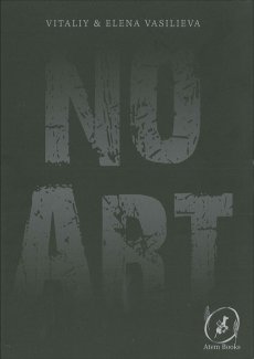
Erworben bei Atem Books
TitelNummer

nexus-verpackerei-2023-buch

Ebert Johannes, Hrsg.: Nexus, 2023

Verfasser
Titel
  • Nexus
Ort Land
Medium

Technische
Angaben
  • 80 S., 21x14,8 cm, keine weiteren Angaben vorhanden
    Broschur, verschiedene Papiere
ZusatzInfos
  • Zur Ausstellung 01.-29.05.2023. Mit Nexus رابط holt die VerpackereiGö die Arbeit des ägyptischen Pavillons der 59. Biennale von Venedig nach Görisried und ergänzt die Ausstellung mit drei weiteren künstlerischen Positionen. Ausgehend von der Arbeit Eden like Garden. Preserved for the chosen ones كجنه عدن للمختارين von Mohamed Shoukry, Weaam El Masry und Ahmed El Shaer, setzt sich die Ausstellung mit grundlegenden und ungeklärten Dilemmata der menschlichen Existenz auseinander. Installative Raumarbeiten von Lukas Rehm, Sameh al Tawil und Tatjana Vall ergänzen die Gruppenausstellung, wobei die Zusammenarbeit von Mensch und Technik sowie die Externalisierung von geistigen und emotionalen Fähigkeiten thematisiert wird.
    Text von der Webseite
Sprache
Geschenk von
TitelNummer

schneemann-mare-than-meat-joy-1979

Verfasser
Titel
  • More Than Meat Joy - Complete Performance works & selected writings
Verlag Jahr
Medium

Technische
Angaben
  • 282 S., 23x27 cm, Auflage: 2.000, 2 Stück. ISBN/ISSN 0914232169
    Hardcover, Leinen mit Schutzumchlag
ZusatzInfos
  • 1. Auflage. Performances 1958 to 1977. The book is particularly rich because it uses the artist's own documentation, photos, notes, sketches, commentary and script-like documents.
Weitere
Personen
Sprache
Stichwort / Schlagwort
TitelNummer

between-the-lines-1

Verfasser
Titel
  • Between the Lines Vol. 1: A Coloring Book of Drawings by Contemporary Artists.
Verlag Jahr
Medium

Technische
Angaben
  • 112 S., 27,1x20,5 cm, keine weiteren Angaben vorhanden
    Malbuch
ZusatzInfos
  • A Coloring Book of Drawings by Contemporary Artists. The coloring book is an integral part of our mission to engage patients through contemporary art. Between the Lines is distributed free of charge to children in RxArt’s participating healthcare facilities and sold to benefit RxArt’s projects. Like the artwork we install, the coloring book is meant to give the children and their families something new and stimulating to think about. It is another tool to take children to an emotionally less stressful place and provides a creative outlet for children confined to the austerity of a hospital room.
    Text von der Webseite
Stichwort / Schlagwort
WEB Link
TitelNummer

smith-abramson-flow

Titel
  • Gotto Go Gotto Flow - Life, Love, and Lust - On Chicago's South side - From the Seventies
Verlag Jahr
Medium

Technische
Angaben
  • 194 S., 24,8x22,5 cm, ISBN/ISSN 9780991541829
    Fadengeheftet, Hardcover, mit Schutzumschlag
ZusatzInfos
  • Poems by Patricia Smith, Photographs by Michael Abramson.
    Bump contests and blues. Love goddesses and shake dancers. The Sexy Mamas and Their Mack. Funky. Sexy. Music and voodoo. Every night like New Year’s Eve. This was the scene that Abramson recorded. Patricia Smith, took a look at Abramson’s photos nearly four decades later and brought his night world back to life. “These fiercely breathing visuals are a last link,” she says, “to the unpredictable, blade-edged and relentlessly funky city I once knew.” Her words and his pictures open the doors and give us a front-row (or a back-row... even better) seat to a time and place long gone. So: Watch. Listen.
    Text von der Website.
Weitere
Personen
Sprache
Erworben bei art book cologne
TitelNummer

grothus-bermuda

Verfasser
Titel
  • The Bermuda Love-Triangle
Medium

Technische
Angaben
  • [48] S., 8,9x12,2 cm, 2 Stück. ISBN/ISSN 0930257065
    Softcover, fadengeheftet, Offset-Druck
ZusatzInfos
  • The Bermuda Love-Triangle, from 1988, is Tom Grothus's most elaborate production. The printing is all offset-lithography on quality stock. The black, red, and yellow cover includes some spot varnish highlights. The 24 leaves inside are printed in blue and black ink, for 48 pages of content. Interspersed among the pen-and-ink drawings are several beautiful duotones of pencil and ball-point-pen drawings. Some of the images in this book are like those of a dream that haunts you with an elusive meaning. The common literary thread throughout is a list of various proposed freedoms, such as the "Freedom to Obey Puppets." These may fill in some of the gaps left in the U.S. Constitution by that nation's founding fathers. Editor's Note: Gripping, lovely, haunted, serene, and impeccably surreal, this book of gentle hallucinations defies categorization. You might call them cartoons, but they will make you laugh silently for weeks. This is one of the nicest books we have ever held.
    Text von der Website.
Sprache
Stichwort / Schlagwort
Geschenk von
TitelNummer

goldsmith_wasting_time

Verfasser
Titel
  • Wasting Time on the Internet
Verlag Jahr
Medium

Technische
Angaben
  • 256 S., 18,1x12,4 cm, ISBN/ISSN 9780062416476
    Broschur
ZusatzInfos
  • Kenneth Goldsmith wants you to rethink the internet. Many people feel guilty after spending hours watching cat videos or clicking link after link after link. But Goldsmith sees that “wasted” time differently. Unlike old media, the internet demands active engagement—and it’s actually making us more social, more creative, even more productive. When Goldsmith, a renowned conceptual artist and poet, introduced a class at the University of Pennsylvania called “Wasting Time on the Internet”, he nearly broke the internet. The New Yorker, the Atlantic, the Washington Post, Slate, Vice, Time, CNN, the Telegraph, and many more, ran articles expressing their shock, dismay, and, ultimately, their curiosity. Goldsmith’s ideas struck a nerve, because they are brilliantly subversive—and endlessly shareable. In Wasting Time on the Internet, Goldsmith expands upon his provocative insights, contending that our digital lives are remaking human experience. When we’re “wasting time,” we’re actually creating a culture of collaboration. We’re reading and writing more—and quite differently. And we’re turning concepts of authority and authenticity upside-down. The internet puts us in a state between deep focus and subconscious flow, a state that Goldsmith argues is ideal for creativity. Where that creativity takes us will be one of the stories of the twenty-first century. Wide-ranging, counterintuitive, engrossing, unpredictable—like the internet itself—Wasting Time on the Internet is the manifesto you didn’t know you needed.
    Text von der Webseite
Sprache
TitelNummer

cotnoir-zine-making
cotnoir-zine-making
cotnoir-zine-making

Cotnoir Brian: On the Mystic, Magick, Talismanic, Alchemical Practice of Zine Making, 2019

Verfasser
Titel
  • On the Mystic, Magick, Talismanic, Alchemical Practice of Zine Making
Verlag Jahr
Medium

Technische
Angaben
  • [14] S., 21,5x14 cm, keine weiteren Angaben vorhanden
    Drahtheftung
ZusatzInfos
  • Heft des Künstlers Brian Cotnoir, der auch der Gründer des Verlages Khepro Press ist. Er beschreibt sein Heft selbst so:

    On the Mystic, Magick, Talismanic, Alchemical Practice of Zine Making is a description of alchemical practice through the making of zines. Alchemy is the art and science of bringing something to its final perfection or completion. And, being perfected, can in turn perfect. It is about making change in the world for the betterment of the world and the soul. You know, like Marx said, “the philosophers have only interpreted the world, in various ways; the point, however, is to change it.”

    Text im Heft.
Sprache
Stichwort / Schlagwort
Erworben bei Printed Matter
TitelNummer

Verfasser
Titel
  • Konvolut Ordner 4 MAIL-ART Projekt Amy Winehouse
Ort Land
Verlag Jahr

Technische
Angaben
  • 30x28,5x8 cm, Auflage: Unikat, 131 Teile. keine weiteren Angaben vorhanden
    Leitz Ordner mit 131 original internationalen Mail Art-Beiträgen
ZusatzInfos
  • Ordner enthält Dekorplatten mit Beschichtungen, Holzarbeiten, Stoff-Applikationen, Postkarten, Kurzgeschichten, Hefte, Künstlerbriefmarken, Zines etc. Amy Winehouse ist gestorben, wird verehrt und um sie wird getrauert. Die Arbeiten entstanden nach ihrem Tod. Teilnehmerliste ist enthalten, von allen die von 2009-2011 mitgemacht haben. Titel des Mailartprojekts "I Like Amy Winehouse". Dazu sind im Ordner "Give-Away`s" enthalten.
Stichwort / Schlagwort
Geschenk von
TitelNummer

Müller Peter: nation buildung kit, 2013

mueller-nation-building-kit1

Müller Peter: nation buildung kit, 2013

Verfasser
Titel
  • nation buildung kit
Ort Land

Technische
Angaben
  • 33x52,5 cm, 24 Teile. keine weiteren Angaben vorhanden
    Sammeltüte mit Klettverschluss, enthält eine kreisförmige Holzplatte, bestempelt und mit Aufkleber. Umschlag mit Bastelmaterial bestempelt und mit Aufkleber. Mappe mit 16 Blättern bestempelt und mit Aufkleber. 2x Briefumschläge, einmal mit einem Songtext und einmal mit einer Postkarte, bestempelt und mit Aufkleber. Buch mit Klebebindung und Softcover, mit gefälschten Banknoten, Vorderseite mit Sticker. Zettel mit Jahreszahl. 2x Leporello. Kleinerstoffbeutel mit bestempelter Vorder- und Rückseite, enthält durchsichtige Medikamentdose aus Kunststoff, mit Aufklebern, kleine durchsichtige Kunststoff- Schachtel, Vorderseite mit einem Aufkleber, enthält einen Teebeutel, kleinen Umschlag mit beklebter Vorderseite und einen quadratischen Magneten.
ZusatzInfos
  • Stoffbeutel mit gestempeltem Titel "nation buildung kit", enthält eine kreisförmige Holzplatte, mit Aufkleber auf der Rückseite, mit dem Titel "building a world focus", die Vorderseite zeigt ein Bild von einer Insel oder einem Land. Ferner beinhaltet der Beutel eine kleine Stofftasche mit einer kleinen ovalförmigen Medikamentendose, mit Tabletten, mit einem Aufkleber "PROZAC SOMETIMES YOU FEEL LIKE A NUT... SOMETIMES YOU DON´T!". Anderer Aufkleber mit dem Titel "building contentedness", ein kleiner quadratischer Plastikcontainer mit einem Teebeutel, die Vorderseite mit einem Aufkleber "building ideology". Kleiner durchsichtiger Umschlag mit einem quadratischen Magnet "NATIONAL RIFLE ASSOCIATION". Die Vorderseite des Umschlags hat einen Aufkleber mit dem Titel "building freedom". Ein Umschlag mit Bastelmaterial für eine amerikanische Flagge, rot-weiße Streifen, ein dunkel blaues Blatt und eine Tüte mit weißen Sternen. Die Vorderseite mit einem Aufkleber mit dem Titel "building a flag". Ein aufklappbares Leporello "building cultur" mit Bildern von Waffen, Essen, Menschen mit verschiedenen Hautfarben, Indianern etc. Ein Umschlag "building power", mit einer Postkarte, die auf der Vorderseite eine Atomexplosion zeigt und auf der Rückseite eine Drohne. Ein etwas größeres Leporello "HISTORY OF THE AMERICAN CIVIL WAR", in einem halben Umschlag "building history", mit Bildern von einflussreichen Personen aus der Zeit des amerikanischen Bürgerkriegs von 1861-1865. Ein Zettel mit der Jahreszahl 2013 und einem handschriftlichen Satz "she´s leaving home". Ein Buch in einem halben Pappeumschlag namens "building faith", auf der Vorderseite ein goldener Sticker in der Form eines Kreuzes. Das Buch "The HOLY BIBEL" enthält chinesisches Höllengeld und gefälschte amerikanische Dollar. Ein Umschlag mit einem Aufkleber mit dem Verlagslogo. Der Umschlag enthält ein Blatt mit einem Songtext mit dem Titel "This is not America". Im Beutel befindet sich auch eine Mappe "building confidence" mit 16 Blättern (geklammert), "DEPARTMENT OF JUSTICE WHITE PAPER",enthalten einen Text gegen den Leader einer Organisation und deren Pläne und Schritte gegen die USA im amerikanischen Bürgerkrieg.
Sprache
Geschenk von
TitelNummer

Verfasser
Titel
  • Self Portrait - Something changing outside my cave like a ignoble hurricane
Ort Land
Verlag Jahr

Technische
Angaben
  • 29,7x21 cm, keine weiteren Angaben vorhanden
    Schwarz-Weiß Fotokopie, fotokopierte Zeichnung
ZusatzInfos
  • Teil des Mail Art Projekts Self Portrait von Wolfgang Rostek
Weitere
Personen
Sprache
Stichwort / Schlagwort
Geschenk von
TitelNummer

Copyrighthinweis: Das Copyright für die abgebildeten Publikationen bleibt bei den jeweiligen Rechteinhabern (Künstlern, Fotografen, Gestaltern, Publizisten). Die Abbildungen und Textzitate dienen der künstlerischen und wissenschaftlichen Recherche. Hier werden Werke dokumentiert, die sonst nur schwer oder gar nicht zugänglich wären. Wer nicht damit einverstanden ist, dass sein Werk auf dieser Webseite gezeigt wird, kann die Abbildung umgehend durch mich löschen lassen. Für wissenschaftliche Recherchen können die großen Abbildungen auf Antrag freigeschaltet werden.
Wenn Sie als Rechteinhaber möchten, dass Ihre Abbildungen bei Klick größer gezeigt werden (Höhe x Breite = ca. 800 x 1200 Px), dann melden Sie sich bitte bei mir: Änderung